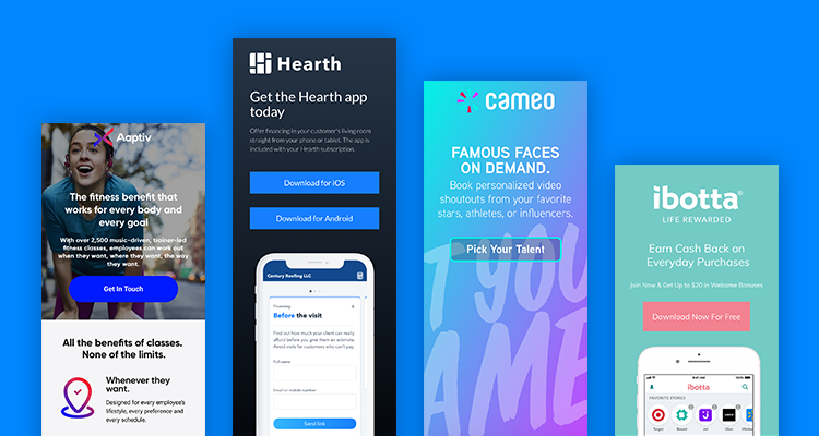
Have you looked at your iPhone’s App Store lately? How about Google Play?
I’ve seen landfills with better curation.
With more than two million apps available on each store, people have a much better chance of finding a pearl in an oyster than randomly stumbling upon your app. No matter how appealing it is—no matter how entertaining or even life-changing—most people won’t discover it without a robust marketing campaign.
(And, to paraphrase Contently’s Bradley Little, going viral is not a strategy.)
The first step in marketing your iPhone or Android app is finding the right channels to promote it. Using Google Ads’ Universal App Campaigns (UAC) is a strong starting point, but many marketers get extra mileage from traditional PPC campaign, social media marketing, app cross-promotion, or even email blasts to newsletter subscribers.
In these cases, you’ll need a stellar landing page to overcome that hesitance we all feel about installing yet another piece of software onto our phones. For this reason, ensuring a buttery-smooth post-click experience is fundamental to the app marketer’s toolbox.
Hence this post. These are some of the best app landing page examples out there, all of ’em built with Unbounce. We want to highlight how you can create a page to promote your own mobile app and, as importantly, why a well-designed landing page can make all the difference. Along the way, we’ll throw in our two cents about what sets them apart.
So hop right into the examples below, or keep reading for a handful of best practices to get you started.
How to build app landing pages
If you’ve created a landing page for any ol’ purpose, you may have encountered some of this advice before. But it’s worth revisiting in the context of app marketing since some elements gain increased importance when you’re hoping to score some downloads. Let’s get started:
- Establish your conversion goal first. As you’ll see from the examples below, an app landing page can be a lot of things. It can be a simple download page with links directly to the Android and iOS app stores. Or you might want your customers to subscribe to your service first. Or they might need to purchase a physical product for the app to work. Regardless, your conversion goal will have a significant impact on your calls-to-action, your copy, and even your design. So start there.
- Start with mobile. If you’re like me, you default to desktop when building a new landing page. (Our builder kinda sorta encourages it, to be fair.) But since apps are designed primarily for phones, it usually makes sense to create your mobile version first. That way, you’ll better set yourself up for those visitors who’re most likely to download your app.
- Keep their attention. This is true of all landing pages, but app pages that encourage a direct download in particular benefit from a 1:1 attention ratio. So don’t give ’em the world. Instead, hit your visitors with the essential information they need to convert.
- Show the device. Ideally, you want to show your app running on a device that’s as similar as possible to what customers are using. Sometimes that’s an iPhone. Sometimes it’s an Android phone. It’ll differ depending on use cases, the campaign you’re running, and the kinds of customers you court.
The best app landing page examples
Aaptiv (Industry: Fitness)
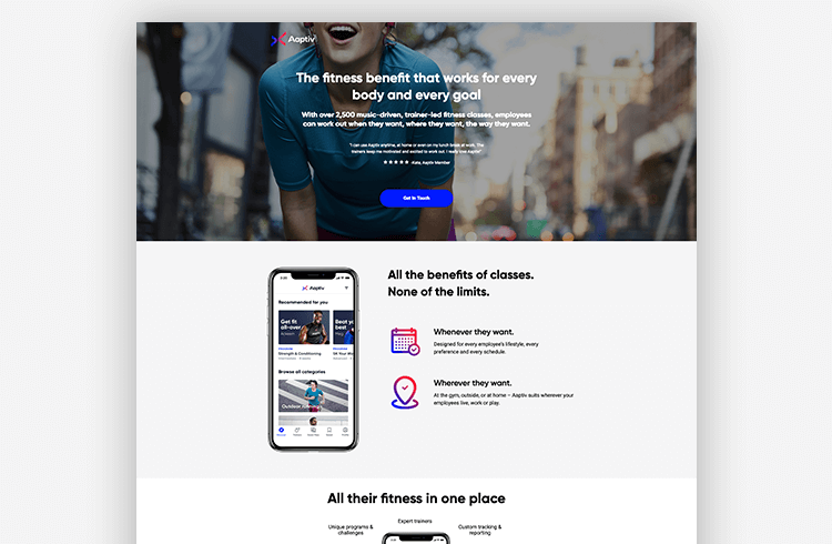
How Aaptiv nails it: Design your app landing page differently for desktop versus mobile devices.
Aaptiv is a name that ensures this app will appear at the top of any alphabetical list. (Ahem, like this one.) But abecedarian branding is not enough to guarantee discovery. Instead, having a powerful marketing campaign, complemented by carefully targeted app landing pages like this one, can help a lot. This particular page focuses on employers who might want to include an Aaptiv account as part of their company’s wellness plan.
Why it works:
- Include big-name clients. The testimonial from an existing Aaptiv member speaks to the flexibility of the app as well as the motivation it provides. I love it. But for employers, logos from prestigious brands like Starbucks and Amazon might be even more significant. If I want my employees to feel like they work for a first-class company, I really can’t do better than matching my wellness offerings with some big names.
- Design for the device. We’ve included screenshots of both versions of the landing page here to highlight the differences between them. For instance, the desktop version has a handy breakdown of some of the app’s features. It also includes a few extra visuals that the mobile version tosses in favor of speedier loads. This ensures both versions are lightning-fast—and both still look like a million bucks—no matter the device that visitors are using.
- Clarity shows confidence. When you’ve got something genuinely hot to show off, as Aaptiv does, it’s best to let your product speak for itself. That’s why the copy here is so straightforward. In the desktop version, Aaptiv’s pitch includes screenshots and copy that show off unique programs, expert trainers, and custom tracking in action. And that’s way more effective than flouncy language.
Advanced Producer (Industry: Real Estate)
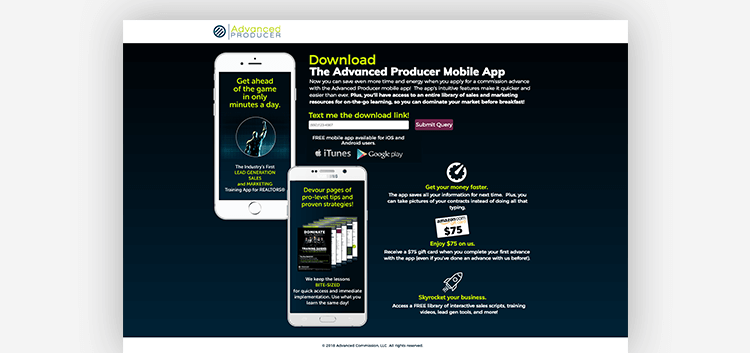
How Advanced Producer nails it: Cut down on frustration by texting your desktop visitors a download link.
The Advanced Producer Mobile App by Advanced Commission doubles as an educational tool and a time-saver for REALTORS® using the company’s commission lending service. Though they have other pages for mobile campaigns, this one’s designed specifically for desktop viewing. Let’s take a look at some of the smart choices they’ve made in creating it.
Why it works:
- Use texting to get them downloading. How do you ensure a download if you’re putting a landing page together for desktop viewing? After all, if visitors don’t have remote app install set up—and not many do—clicking a link to either app store from a desktop leads to an error message. That’s… not good. Advanced Producer cleverly gets around this problem by sending an SMS directly to their phone.
- Use powerful language. REALTORS® are a competitive bunch, and they don’t have time to waste on namby-pamby apps. Both copy and design here respect that. It’s not just a matter of using forceful words (“dominate your market,” “devour pages of pro-level tips”) but also of being direct and to the point.
- Say what platforms you support. For a while, it seemed app developers were all about Apple. But since Android phones outnumber iPhones in the US, it’s a good idea to let your visitors know that your app is downloadable on Google Play as well as in the iTunes app store (assuming, y’know, that’s actually true).
Cameo (Industry: Talent)
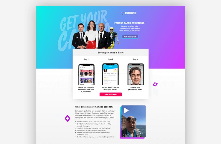
How Cameo nails it: Show your app in action.
Cameo’s unique service: personalized shoutouts from celebrities, athletes, and influencers that you can send to your friends, family, or coworkers. Talent earn money for a minute of their time, and customers get the thrill of a lifetime. It’s a charming idea, and an easy-to-use app lies at the heart of it. Trust me, your mom will love those birthday wishes from RiFF RAFF.
According to Tyler Mabery, the designer from KlientBoost who created this page, the challenge was letting users know how to use Cameo:

I made a section that explains the three steps in getting a Cameo so that users know exactly how the service works. I decided to have it peeking above the fold so that users would scroll down more to read about the service. It worked and this page is getting an 85% click-through rate.
Why it works:
- Keep-it-simple steps. As Mabery says, the page isn’t shy about letting users know exactly how it works. In Cameo’s case, you don’t need a degree in rocket science to understand the app—browse talent, book talent, get yer video from talent. 1-2-3. But that’s the point. It’s easy. Listing steps when it’s effortless reinforces simplicity.
- Show them how it works. It’s not always possible to highlight everything your app does. But clever use of animation or video can show off either functionality or results. Here, for instance, Cameo provides a sample from “Mr. Wonderful” himself, Shark Tank’s Kevin O’Leary. Another video, showing a fan’s reaction to a message from Cody Ko, is even more powerful. (And, yeah, I had to look him up too.)
- “What’s it good for?”That’s the kind of question that a lot of marketers forget to answer about their products. Cameo’s app landing page uses a lot of space to communicate its many uses. They even provide lively, humorous examples—“Have Chris Harrison give a gift better than ‘the Final Rose’”—that inspire creativity and fun.
Carly (Industry: Automotive)
How Carly nails it: Design a landing page that actually fits your offering.
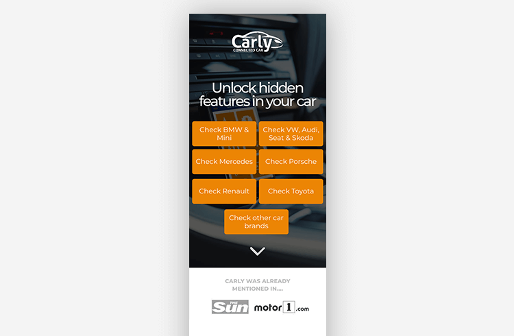
Some apps just install and go. In those cases, just providing a download link can be the best choice. (Though you should take care that your app landing page doesn’t end up looking generic.) But like many sophisticated tools, Carly’s “connected car” needs a little something extra to unlock your car’s hidden features. For this reason, they’ve designed a page that funnels potential customers into the right checkout flow for their needs.
Why it works:
- Offer options (if you have to). Now, usually Unbounce recommends keeping your landing pages focused on a single call to action. But here’s another approach. Since it can be a challenge to accurately target prospects based on the car they drive, Carly’s page features seven buttons. Clicking on one takes you to a shop page that matches your needs. (Hitting a store page right away might be jarring, though, so it’d be worth testing what might happen if visitors are funneled to a second-stage landing page tailored to each manufacturer.)
- Keep the eye moving down. Ideally, a visitor would immediately check to see if Carly supports their automobile. Then they’d buy the device. But conversions rarely work out that way. (We wish they did!) For the unconvinced, an animated arrow keeps them scrolling to a more detailed rundown of the product, its benefits, and some crystal clear illustrations of what it can do.
- Under the influence. I don’t know the first thing about Beemers. (I take the bus to work most days.) But Justin Buice does. He’s an influencer who runs a successful channel dedicated to customizing and upgrading BMWs, and his YouTube video is featured in place of a testimonial on this page. If I were to tell you that Carly rocks, you’d likely scoff. (“Take a hike, bus boy!”) But the same claim from someone like Justin will convince you.
Crash Detech (Industry: Automotive Safety)
How Crash Detech nails it: Provide free alternatives to paid services.
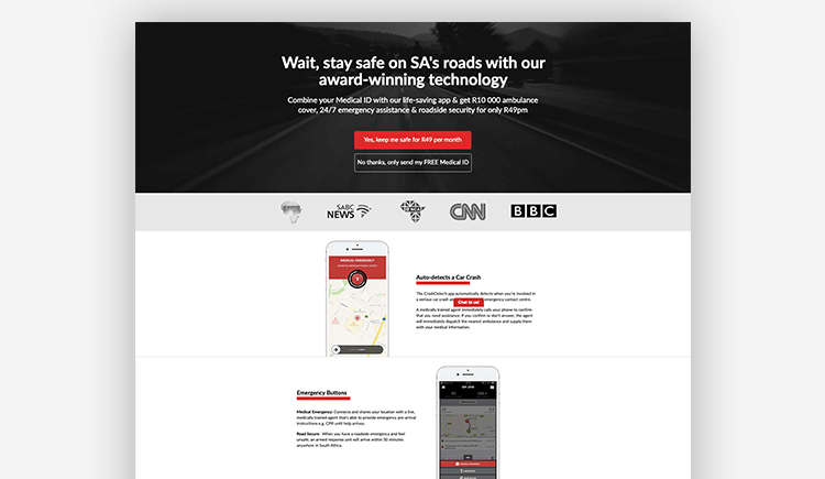
South Africa has some of the most dangerous roads in the world, and Crash Detech helps keep drivers safe by alerting emergency responders. But even a life-saving idea needs a brilliant marketing campaign behind it. That’s where this app landing page comes in. It’s actually the second step of a “free medical id” campaign that’s designed to encourage subscriptions to the service.
The company’s CEO, Jaco Gerrits, provides a little context about how it works:

Our main aim is to convert users on our paid subscription, but we also offer an alternative where they could ‘try the app for free.’ Once the user clicks the CTA, a welcome SMS/Text is sent with a link to our app, encouraging users to download and sign-in. We then use automation techniques to retarget users who have not downloaded and signed in to the app, to further improve our conversion rates.
Why it works:
- Offer a free alternative. There are two buttons here, allowing visitors to either sign up for the paid subscription now or to get a free version of the service. Onboarding people into your app with limited functionality (or using a free trial) does two things. First, it lets them try before they buy. And, second, it begins a lead nurturing strategy that’ll eventually convert many unpaid users into paying customers.
- The promise of safety. Safety and security can be powerful motivators, as they are throughout this page. According to Gerrits, the copy here immediately establishes “a strong connection with the visitor using emotive header text. Our sub-header summarises our benefits, providing a solution to keep you both safe and secure.”
- Use media coverage as a source of credibility. If you’ve been lucky enough to be featured on local or international news—for good reasons, I hope—including it on your landing page, as Crash Detech does, can lend you legitimacy and overcome skepticism. (In an age of ‘fake news,’ it’s best to go with the most reliable sources you can.)
Hearth (Industry: Home Renovation/Financing)
How Hearth nails it: Keep it simple to keep visitors focused.
Hearth offers quick, affordable financing for home renovations. They also work in partnership with contractors to help connect potential customers to lenders and close more sales. That’s where this app comes in: it allows people to pre-qualify for a renovation loan during an on-site visit (or at any other time, really).
Why it works:
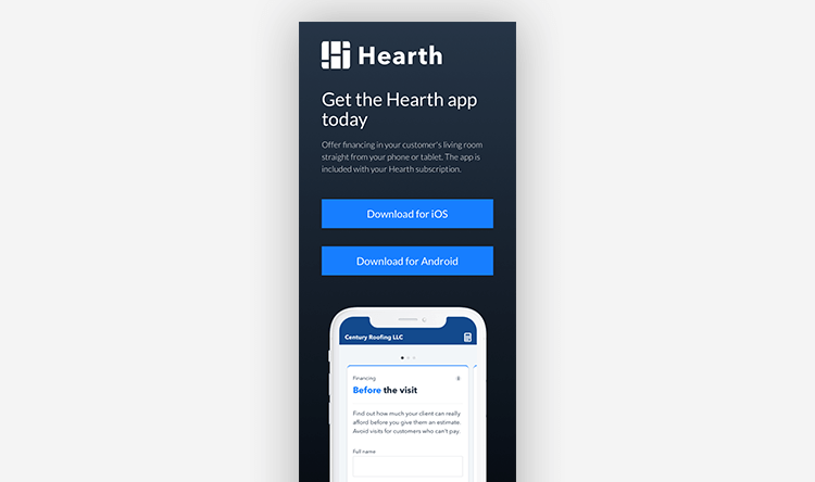
- Just the essentials. If you’re a creative, it can be easy to get carried away adding bells and whistles to your landing pages. The truth is, Hearth has other pages on their site that do a lot of the persuading. This landing page has one purpose—encouraging existing subscribers to download their app—and it does that cleanly and directly.
- Buttons above the fold. It’s very common to see an app landing page that forces users to scroll to find a download link. Hearth smartly chooses to put them both near the top. They also keep them large and spaced apart to overcome the “big hands, small device” issue that plagues contractors.
- Lighten the load. At Unbounce, we have a lot to say about the importance of speed. But speed is doubly important for mobile app landing pages. When you access this page on a phone, you notice how snappy it loads (in about 2 seconds). That’s because Hearth keeps it light for smartphone users by resisting the urge to include unnecessary content (like, for instance, an animated .gif showing the app in motion).
Ibotta (Industry: Retail Rewards)
How Ibotta nails it: Use a simple page as a gateway to more mobile engagement.
Ibotta promises real cash back when you make purchases at participating retail stores. The app allows shoppers to scan receipts, link their loyalty cards, and even make purchases directly from their phones. Because there’s a fair bit of onboarding involved, however, they use simple app landing pages like this one as gateways to a more detailed sign-up. (Also, say their name aloud for today’s ‘aha!’ moment.)
Why it works:
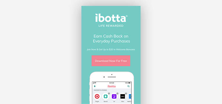
- Simple doesn’t mean silent. Like the example from Hearth above, Ibotta’s app landing page looks pretty basic. But just think about how much they’re saying on this page with a couple dozen words. First, their promise is crystal clear: “Earn Cash Back on Everyday Purchases.” Then, they sweeten the deal with the promise of a bonus for signing up. Even the button reminds you that the app is free to use.
- Cut it short. If you look at the whole page, then you’ll notice that Ibotta only bother to include the top third of the phone here. Beyond what you can see when the page loads, in fact, there’s nothing but the footer. This keeps the page light and focused. It also means that the option to download Ibotta—whether you click the button or on the footer link—is never not on the screen. Genius!
- Downloading the app is just the start. For Ibotta to succeed, they need users to get aboard that sweet mobile engagement loop and start using their app on the regular. For this reason, clicking brings visitors to a more detailed sign-up page (where they can create an account using Facebook or Google) that also serves to better onboard subscribers.
Overwolf (Industry: Gaming/esports)
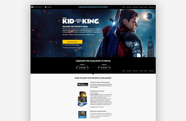
Considering the size of the gaming industry, ‘niche’ is definitely not the right word to describe Overwolf’s target market. But this landing page is a killer example of just how engaging a specific demographic goes beyond witty copy and sharp design. As part of a cross-promotion with 20th Century Fox’s The Kid Who Would Be King, Overwolf has crafted an experience that speaks directly to younger gamers who make up the audience of this film.
Overwolf’s Communications and Content Manager, Shay Zeldis, lays out the strategy in detail:

It’s a page built for players of CS:GO, League of Legends, and Rocket League, with strong incentives and gaming hardware prizes, in a tested layout that increases conversions. To drive traffic and gamers who are ready to participate, we focused on community, social and video channels, with relevant materials hyping up gamers even before they land in the page.
Why it works:
- Gamify your app download. This isn’t just a landing page, it’s a challenge. How do you get started on your path to glory? You download Overwolf’s Game Summary app, win a match of one of three popular games, then share the results on Twitter. It’s a brilliant way to incentivize downloading and reflects the competitive spirit of esports.
- Lean into cross-promotion. The tie-in with The Kid Who Would Be King goes beyond just using a logo. The copy here blends Arthurian legend (“Set out on a magical adventure”) with how gamers speak to one another (missions, custom games, eliminations, goals) to create a sense of fun.
- Pick the right social channels. As CEO Uri Marchand put it in a recent Medium post, “brands trying to reach gamers in the same ways they approach random website visitors quickly learn their mistake.” Overwolf, for instance, has learned to hit the community and social channels where young gamers actually congregate. For example, they created these awesome promo and reaction videos on YouTube that hype before they ever see the landing page itself.
Don’t wait for your app to be discovered
You’re a SaaS company looking for subscriptions to grow your business? Cool. An indie game designer hoping to release the next Flappy Bird? Great. Just generating ad revenue by providing a free tool? That’s terrific. In any case, creating a mobile-responsive app landing page is a great way to introduce yourself to an app-hungry public.
These days, there’s an impressive variety to businesses that are out there promoting an app of some sort. Sometimes it’s the very core of what they do. Other times, it’s an add-on that enhances an existing service. For some apps, a clean download page and a tightly run PPC campaign are all that’s needed to strike digital gold. But others require incredibly nuanced design, whip-smart workarounds, or Gary Kasparov levels of strategy.
(I’d venture to say you’ve seen all three in the examples above.)
Whatever your approach, and whatever your app is promising, you’ll need to stand out from the competition. An app marketing campaign that includes a few spiffy landing pages is your best bet in kickin’ off that mobile engagement loop.
Best landing pages for apps: related content
I just blasted you with a ton of information, but there’s more to learn! If you want your landing page to perform like Queen at LIVE AID in ‘85—sorry, just watched that movie—then you need a kick-butt conversion system. The pieces below should help with that:
- Before you convert people on your page, you gotta get them to your page: Read Brad Smith on how you can move beyond PPC best practices.
- Haven’t built a page yet? Unbounce and Skillshare have you covered:
A Free Video Crash Course from Unbounce and Skillshare - Finally, this is for those of us who just want a little more inspiration in our lives: Here are the best landing page examples for your swipe file.
Original Source: 8 Incredible App Landing Pages (and How You Can Create Your Own)

No comments:
Post a Comment