
Insurance is a complicated thing to market: it’s the only product that people will willingly pay for every month yet hope they never have to use. Of course, this is reasonable when you consider that it’s something used only during times of strife, injury or death.
So it’s no surprise that insurance companies find all sorts of ways to minimize the focus on those more unsavoury aspects of the deal, instead opting to push messages of security, reassurance and convenience — or they just skirt the subject altogether, focusing solely on discounts and savings.
But avoiding specifics rarely goes well, as you’re about to find out. Below, you’ll find my analysis of six insurance landing pages, along with critiques and lessons you can apply to your own campaigns within any industry.
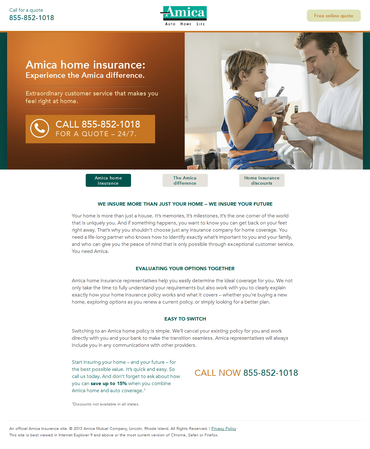
1. Amica Home Insurance: It’s not all about you
I’ll defer to copywriting expert Joanna Wiebe on the subject of using the word “we” in your landing page copy:
“We” is a bad, bad word in copywriting. You should reword every line of copy you have that begins with “we”. […] Because your visitors don’t want to hear about you. They want to hear about themselves – about their problems, about their needs, about their futures.”
The word we is used four times on this page. But even when that word isn’t being used, Amica seems to find it impossible to not talk solely about themselves:
Amica home insurance: Experience the Amica difference.
Extraordinary customer service that makes you feel right at home.
What does that mean? It does nothing to speak to the prospect’s needs. It does nothing to communicate how this service will improve the customer’s life. And it doesn’t make any effort to capture the reader’s attention nor compel them to continue reading.
If you want to talk about your extraordinary customer service, demonstrate it up front: be honest and transparent. In Amica’s case, they should consider communicating the real-world benefits of their service versus other providers, instead of dedicating so many words to saying so little.
2. StateFarm: Remind me how I got here
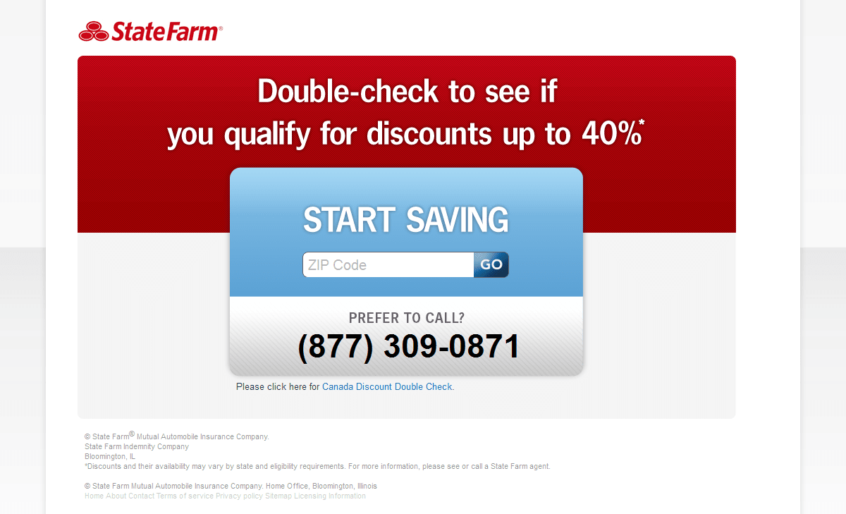
Can you guess what this page is about?
That it doesn’t explicitly mention insurance might seem unimportant. Surely the person who clicked the link to this page doesn’t need to be reminded what they came for, right?
But message match — how well the message of a landing page matches the message of its gateway, like an ad on Google or Facebook — is one of the pillars of creating an effective landing page. Essentially, the copy of an ad and the headline of its landing page should mirror each other. Why?
- It’s a reminder. Admit it: you’ve opened new tabs in your web browser only to immediately forget why you had done so. That’s probably because your attention span is literally worse than that of a goldfish.
It’s not hard to imagine that someone could lose focus on what brought them to the page in the first place.
- It’s a reassurance. Even if the user doesn’t forget what brought them there, they could think that you’ve brought them to the wrong place, or pulled a bait-and-switch. When ad copy and page headline match, they send a clear message: “This is exactly what you were looking for.”
Since State Farm’s page would likely be displayed in results for searches for automobile insurance, it’s crazy that the only place those words are even mentioned is in this itty-bitty footer text.
3. AIG Direct: Specificity is a good thing
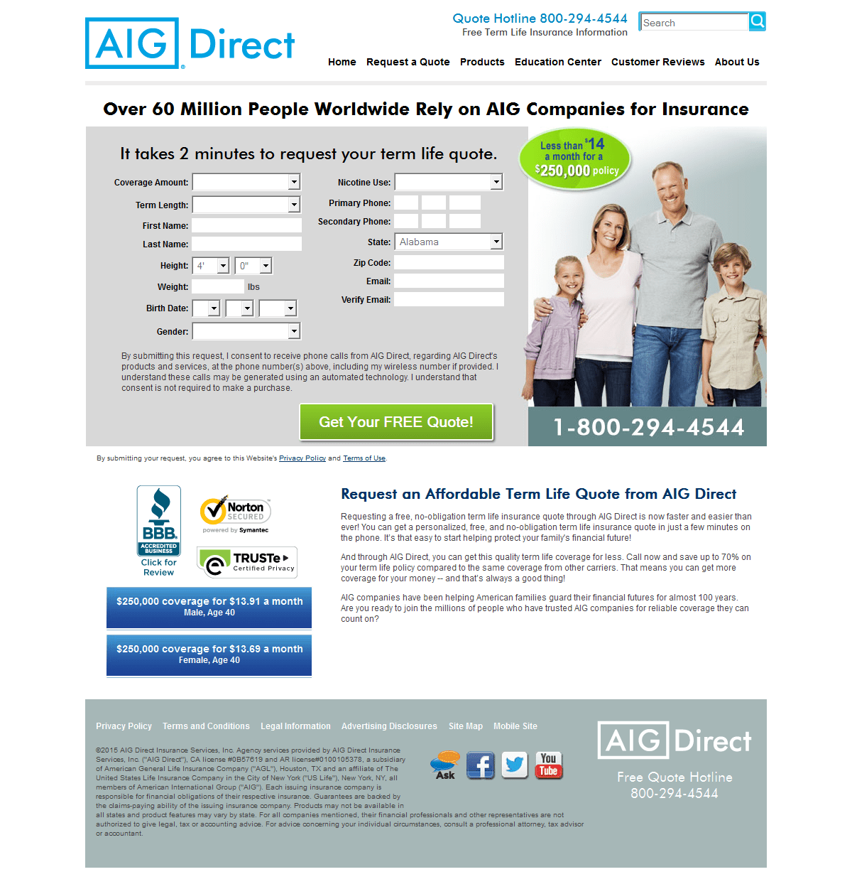
So many of the insurance landing pages I came across in my research asked for extremely little information up front — often just a zip code to begin the quote process. So I was surprised when I saw this monster of a form from AIG Direct.
But I actually think this makes a lot of sense. While it’s true that the number of form fields tends to correlate negatively with conversion rates, this isn’t always the case. Introducing more friction up-front can help pre-qualify leads, and in the case of an insurance broker, having to provide that kind of information is almost reassuring.
If the length of the form alone is enough to make the prospect hesitate, AIG’s headline serves to make the task seem almost effortless:
It takes 2 minutes to request your term life quote.
While one could feel overwhelmed by the number of fields, this one line makes it clear that it’s not really that bad. Plus, two minutes is a pretty small investment when we’re talking about life insurance.
This page excels in some other areas, too. Rather than rely on fluff and wishy-washy philosophizing about the nature of life and family, AIG sets concrete expectations, thereby holding themselves accountable for meeting them.
By solidifying their trustworthiness by linking to reviews and security certifications, and keeping the focus on the customer rather than themselves, AIG comes across as credible and transparent. And a real dollar amount, no matter what it is, is always preferable to nebulous “savings.”
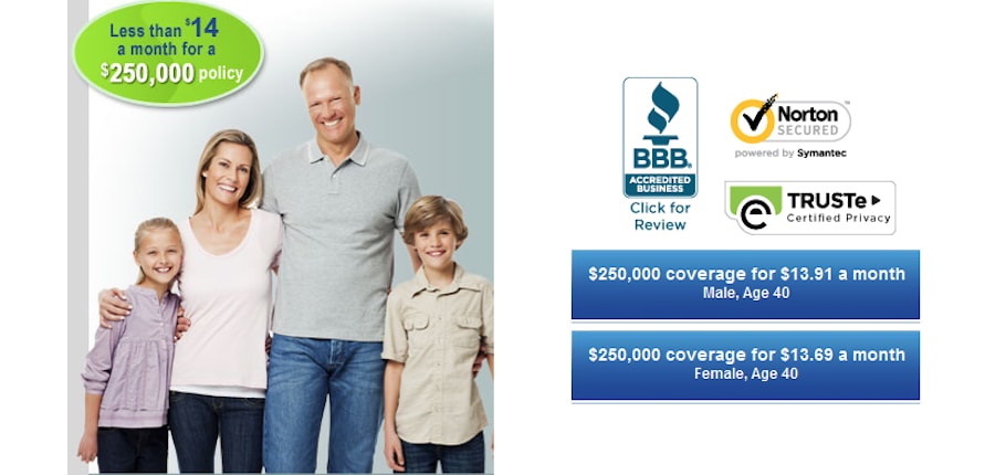
4. AAA Life Insurance: Make your form friendly
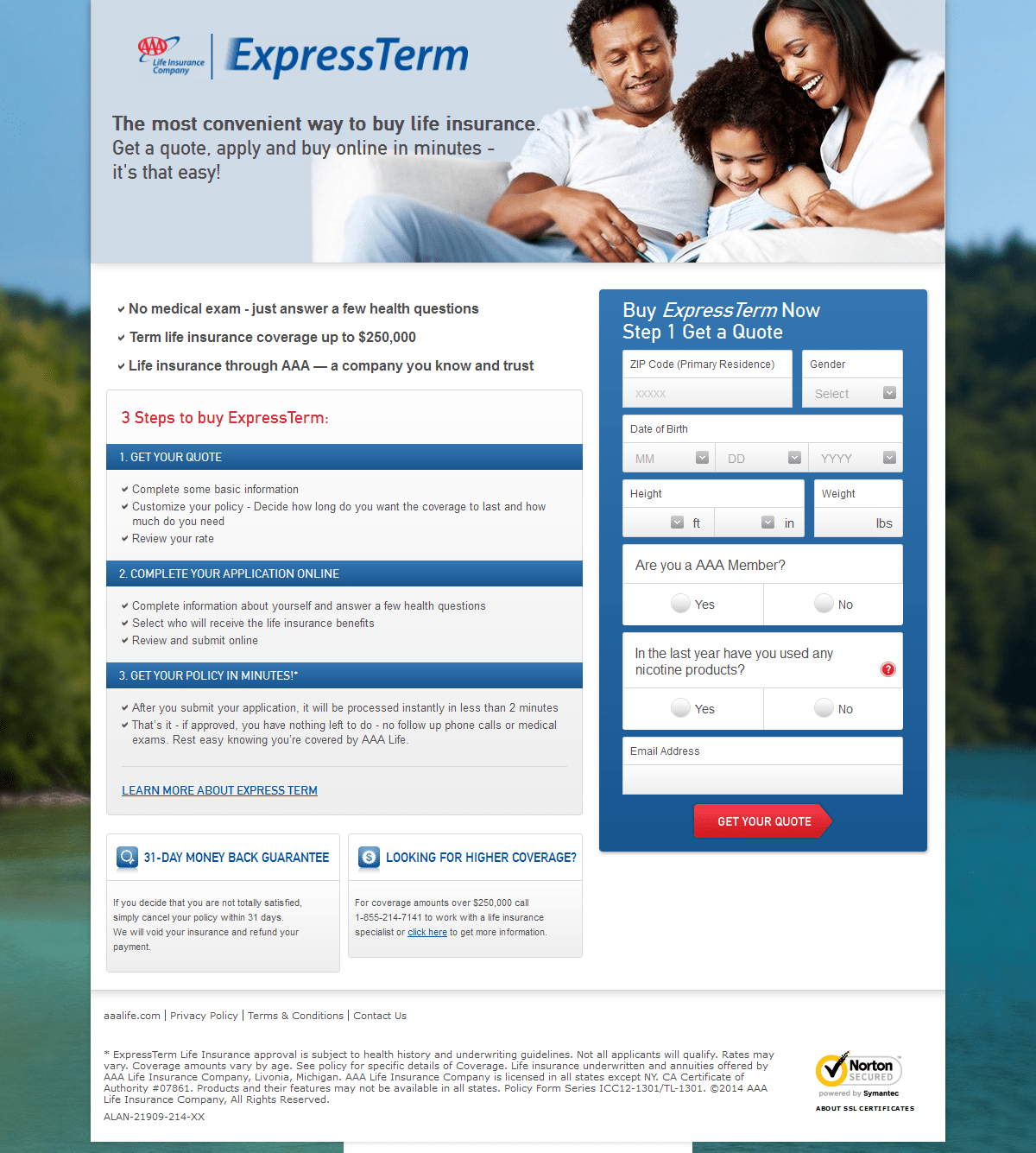
I feel confident in saying that most people probably don’t enjoy shopping for life insurance very much. So it’s in your best interest to make the process of doing so seem as easy as possible.
This page from AAA makes this process seem so much worse than it (likely) actually is. And it all starts with the strange visual decisions made in the form’s design.

In web design, an affordance refers to a visual indicator of a digital object’s function. The most obvious example is adding bevels, borders, and background colors to links in order to make them resemble physical buttons. These details make it easier for the user to understand what these intangible objects actually do.
This form’s affordances are, frankly, all messed up. Not only are many of the form fields — text fields, in particular — nearly unnoticeable, but form labels and form fields are both contained within identical boxes, making the labels also look like fields.
Not only is this confusing, it has the unintended result of making the form appear twice as long as it actually is.
This, combined with the fact that most of the content on this page is dedicated towards explaining all of the subsequent “steps,” make this entire process seem extremely unapproachable.
Maybe they should’ve written that it only takes two minutes.
5. Farmers Insurance: Show me the way
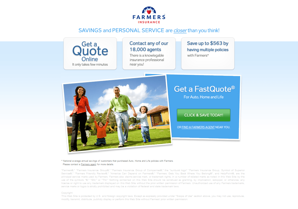
This page from Farmers Insurance is likely to lead visitors in the wrong direction due to inaccurate visual cues and confusing copy. If you’re on this page to get a quote online, where would you think to click?
Would it be, perhaps, this big button-looking-square that says Get a Quote Online on it?

You’re likely already aware that this isn’t the case: the actual call to action is the green Click & Save Today! button. But I actually completely missed it at first.
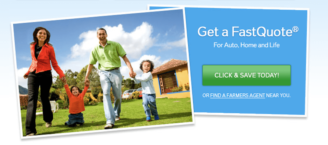
Why?
- It’s framed identically to the stock photo next to it, which I glossed over
- It’s also shares a colour palette with the photo, making it blend into the page
- The family is both walking and moving away from the call to action, rather than directing attention towards it
- The copy — both “Get a FastQuote®” and “Click & Save Today” — were both less related to what I was looking for than “Get a Quote Online”
While there’s lots of talk in the conversion optimization world of color psychology and which colors correlate with which emotions, all of this is secondary to the most basic notion of CTA design: make it contrast with the rest of the page. (Psst — learn more about driving conversions through design in our new Attention-Driven Design ebook!)
And with regards to the button copy, it needs to indicate action and also speak directly to the user’s desire. For a smart formula, I’ll quote this oft-repeated advice from Joanna Wiebe:
Write button / CTA copy that completes this phrase: I want to ________________.
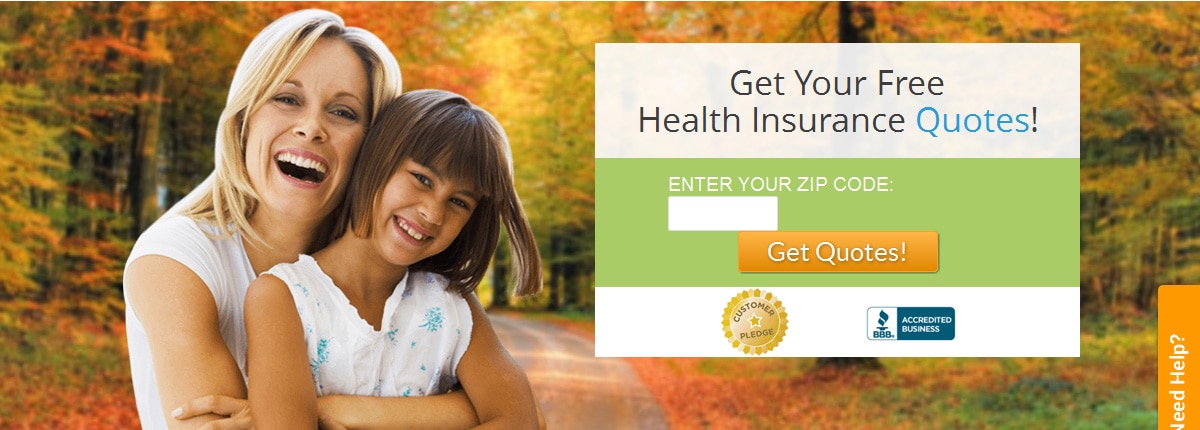
6. Health Insurance Sort: Cheap photos cheapen your page
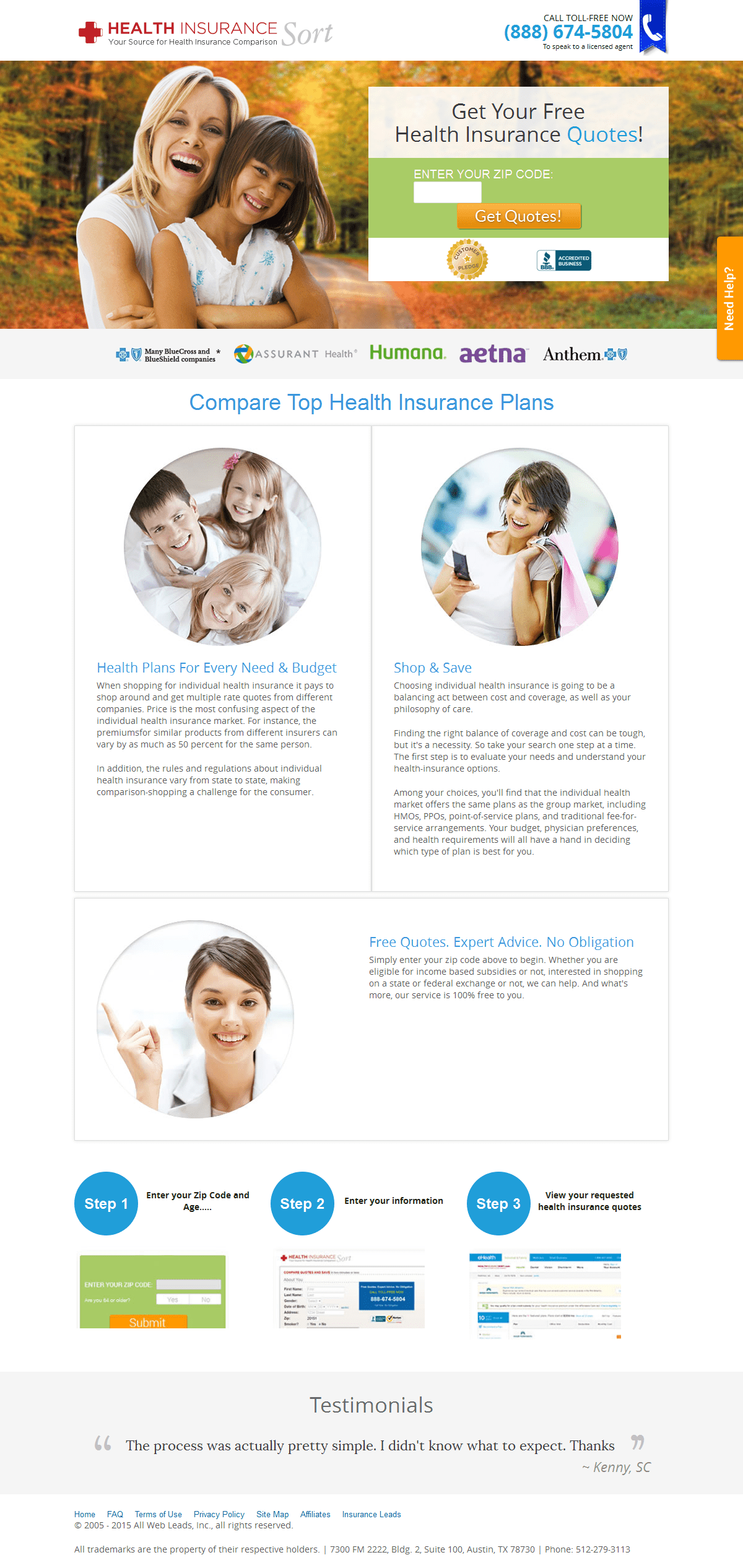
Insurance is a pretty serious thing, let alone insurance that would, in a time of crisis, allow me to remain alive. So I would expect anyone selling it to me to take it equally as seriously as I do.
But everything about this page screams, “we’re not credible.” And while the copy isn’t great, the most glaring issues relate to its design.
Stock photos such as the ones shown above are often used to add “visual interest” to a page. This, despite the fact that usability testing shows that while photos of people are effective at capturing attention, they subconsciously gloss over images that resemble stock photos.
Many of the examples in this post are clearly using stock imagery, but this page is exceptional. Each photo has a completely different lighting and style, and the hero image is so obviously a poor composite of two different images that I can’t believe anyone would ever enter their zip code into that misaligned text box.
Fluff is thy foe
When crafting landing pages, “fluff” is thy foe. Whether it be pointless stock images that desperately try to jazz things up, or copy that talks its way around the real benefits and value of your offering, attempts at obfuscation via feel-goodery are as exactly as transparent to customers as they are to us.
And landing pages aren’t mere repositories for information; they’re designed to be a response to a specific need or expressed intent. If someone comes to your page and finds it confusing or deceitful, you can kiss that conversion goodbye.
Original Source: Fluff is Thy Foe: 6 Insurance Landing Page Examples + Critiques
No comments:
Post a Comment