
It’s landing page examples time.
I’ve compiled a list of 36 landing page designs to critique. Most of them are awesome, some need a bit more work and a few are downright awful (as a lesson of what not to do). Each will get my customary “what I like” and “what I’d change or test” so you can get some ideas and inspiration for your next page.
Here are the landing page design principles I’ll be using as a framework when delivering the critiques:
- Encapsulation:
This is a classic technique used to hijack your visitors eyes and create a tunnel vision effect. You can think of it like creating a window on your landing page where your CTA is the view. - Contrast & Color:
Some say button color is important, but this a falsehood. In reality, it’s the contrast of the color that you need to focus on. A green CTA may well outperform red in some circumstances, but if the page is dominantly green, that green button is going to get hidden among other page elements. If you focus on contrasting colors you will be much more successful at making it stand out. In the case of the green page, a red button would be suitable. - Directional Cues:
Call attention to the most important page elements by using strangely placed and angled arrows. Tie a sequence of arrows together to define a path for the visitor to follow, ending at your CTA. - Whitespace:
Give your page elements breathing room to produce a calming effect and allow your CTA to stand out from the rest of your design. - Urgency & Scarcity:
Common psychological motivators are the use of urgency (limited time) and scarcity (limited supply). - Try Before You Buy:
By opening your product to scrutiny before the purchase you appear confident. This increases trust and is an important factor in boosting conversions. - Social Proof:
Social proof is created by the statistics and actions of a particular crowd and it can greatly enhance the “me too” factor. The major benefit is a level of authentic believability.
A practical application
To demonstrate how to apply these landing page design concepts, I’ll show a before and after template design example. The purpose of this particular template is to facilitate the download of an ebook in exchange for the standard name and email.
Note: This template is available for use within the Unbounce landing page platform suite of landing page templates.
The template: before landing page optimization
The template: after landing page optimization
36 landing page examples critiqued for conversion
Are you excited to see some sweet examples? You should be… there are 36 of them. Most are from Unbounce customers, but I’ve thrown in some scary ones too, just to mix it up, and to scare you into making your own pages better.
I’m sure this isn’t your first landing page rodeo, so saddle up, get your design hat on and take a ride with me down landing page lane.
Let the critiques begin…
Create Higher-Converting Landing Pages Using Conversion-Centered Design
1. Mobile Commons
What I like
- Clear and enticing headline: Your headline is the first thing that people need to see on your landing page, and Mobile Commons does a good job of utilizing its headline to describe what it does, and make you want to keep reading to “Find out why” .
What I’d change or test
- No back up to claim of 10x conversions: Stating that you’ll get a 10x conversion improvement is a very bold claim. It would essentially mean that someone converting at 10% would have a conversion rate of 100%, which isn’t attainable. It would be more effective to have a customer testimonial talking about the conversion improvement they achieved.
- Button copy needs to describe it’s purpose: This is a simple one to remedy. Your CTA button should always explain explicitly what will happen when it’s clicked, for two reasons: firstly, so people will know what they are going to get, and secondly, so there is another element on the page backing up its purpose. In this instance, I’d suggest something along the lines of “Arrange a call back to discuss a mobile solution”.
| Design principle | How’d it do? |
| Encapsulation | Nicely encapsulated form area: Design principle #1 talks about the use of encapsulation to bring attention to your form areas. Mobile Commons again does a nice job here, making sure the conversion area stands out from the rest of the page and making it clear where you need to go to complete your interaction with the page. |
| Color and Contrast | Button color: The CTA should be changed to stand out more from the rest of the page. Right now the blue is swallowed up a bit. It is a nice contrast to the form background, but overall the page has conflicting colors. If you stood back and looked at this page, you’d be hard pressed to identify the most important element. Some of this could be resolved by moving the customer logos to the bottom of the page, potentially in greyscale to prevent them from conflicting with the rest of the page. |
| White Space | Crowded page could use some whitespace: Design principle #4 talks about the use of white space to improve the clarity and reading experience of your page. By making the page a little longer, Mobile Commons could make each part of the message more clearly chunked into digestible blocks. It could also draw more attention to the testimonial, by shifting the left column away from the form. |
| Social Proof | Powerful testimonial: The testimonial from the CEO of Tumblr is very compelling. It’s a brand that many are familiar with and lends a lot of credibility to the page. |
2. Macquarie University
Thoughts
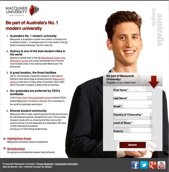
This one’s hard to critique. It’s a really good landing page. Oh, but there is the dreaded Submit button again! Tsk Tsk. There are a few things I’d suggest to keep the landing page experience intact. Firstly, I know people are afraid to remove links (or “leaks” as I call them), but you really don’t need to cite every claim you make at this point. It’s not a whitepaper, it’s a marketing device. Secondly, the form area needs a little work. I’ll describe a hypothesis for each.
Hypothesis for A/B testing
The form area:
By enhancing the messaging of the form area to explain, and focus on, the purpose of the page, the clarity of communication will improve and encourage more people to complete a form they know will benefit them. This will also increase the number of relevant and qualified leads.
Page leaks:
Distractions remove people from the reason *you* have paid them to be here. Removing all links on the page so there is only one action will increase the engagement with the page’s conversion goal, increasing form completions and reducing the bounce rate.
A/B testing advice
Suggestions on what to test to prove the hypothesis:
- Clarify the form’s purpose: The form header is your one chance to describe the reason why you’re asking for personal data. Here the wording suggests that you complete the form to “Register to their event”. Yet, having skimmed (that’s all people will do) the page copy, I see no mention of an event. And the dreaded Submit button does nothing to clear it up. Will you receive information about the university based on your level of study (Current? Desired?) or a prospectus for available courses? So my test advice is to say exactly what you will receive in the header, and reinforce that in the CTA.
- Never submit: You were warned.
- Leaky page: Take away all of the links on the page (except for the privacy statement). If you really need to link to something, do it in a lightbox to keep prospective students on the page.
- Add a FAQ: You can remove the need for so many questions by opening a FAQ page in a lightbox that addresses all of the questions you are currently answering via external links. This will reduce your total points of interaction to three: The CTA, privacy policy and the FAQ.
| Design principle | How’d it do? |
| Encapsulation | This is an obvious one. The form is nicely contained in its own box, which helps it stand out from the image behind it. |
| Directional Cues | The arrow may be small, but it’s a reminder that the form is where the action’s at. Knowing this right off the bat relaxes the mind so that it can explore the content on the page, knowing that you know where to go if you decide to continue on. |
| White Space | The form area is nicely separated from the content, and there is a lot of breathing room all around the main image. A really good demonstration of how to use white space properly. |
3. American Bullion
Thoughts
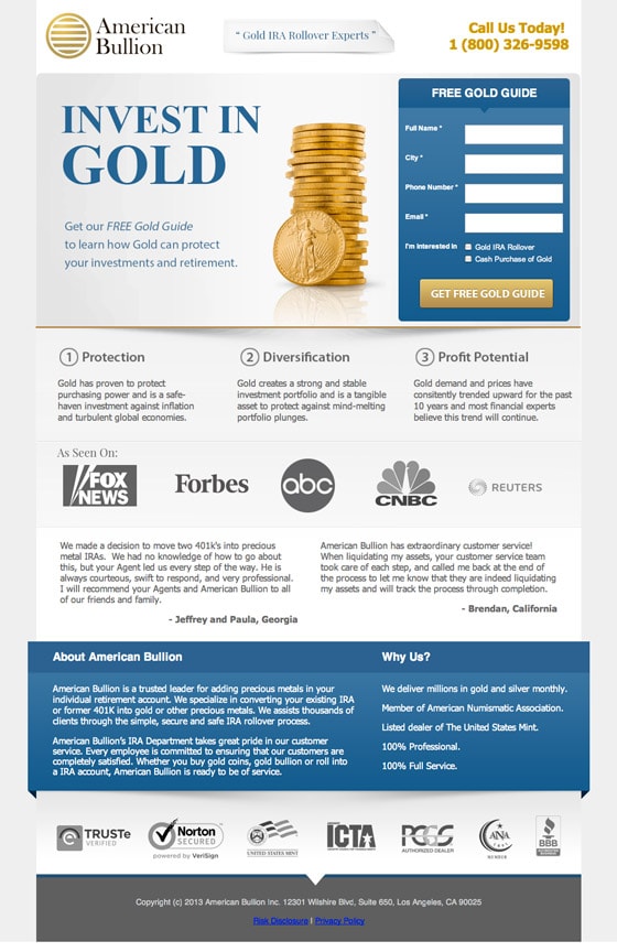
Oh dear. What am I supposed to do with this one? It’s a great page. So I’m going to do a 180 here and talk about what I like about it.
What I like
- Descriptive headline: The headline tells you what the page is about in three words.
- Simple intro paragraph: Describes what you’ll get for completing the form.
- Perfect form header and CTA: A descriptive form header and button copy.
- Supporting information: Everything you need to know is pretty much above the fold, but if you’re not convinced then you can check out a large amount of social proof below including: testimonials, media mentions and trust symbols.
The only thing I would add to this page would be a sub-header above the three steps to say what they are about: such as “About Gold Investing”.
| Design principle | How’d it do? |
| Encapsulation | I’m being spoiled today. Another form that’s sitting nicely in a container. ‘Nuff said there. |
| Color and Contrast | This would be *really* good if the bottom blue area was a different color — perhaps just a dark grey. Then the only blue area would be the form container, which would really pop out. I also like how the trust logos are knocked back by being in greyscale. This keep them visible but not conflicting with more important areas. |
| Social Proof | There’s a ton of social proof logos on display here, although I think the lower set of logos is overkill. The two testimonials could use a different treatment to make them stand out as quotes rather than the current design that makes them look like a block of text like the rest of the page. |
4. Florida Hospital – TAVR
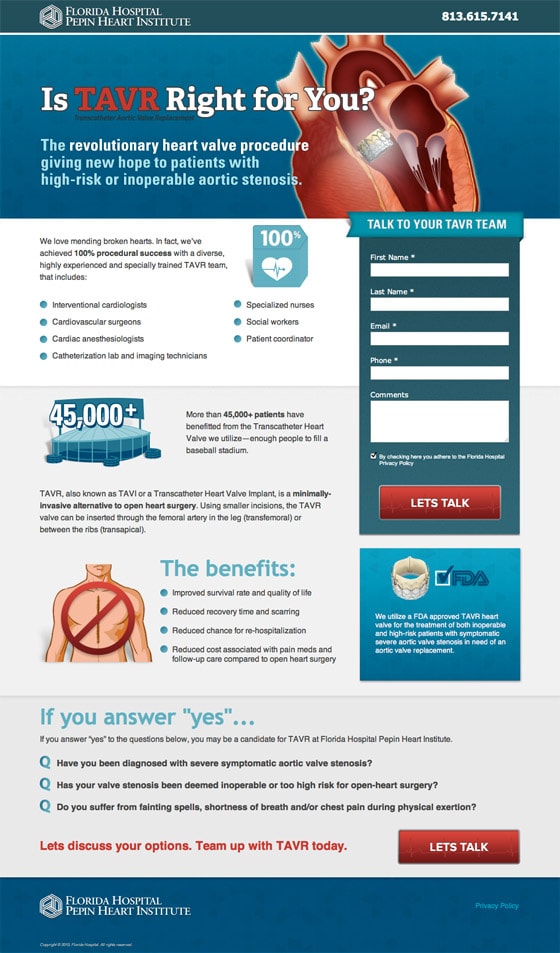
Another excellent landing page. Although I don’t get a clear sense of what TAVR is right away (the tiny description of the acronym is hard to see). If you have highly targeted ads, then you need to make sure the headline is a clear match with them.
Hypothesis for A/B testing
By being more explicit in the headline about what TAVR is, more people will be able to relate, staying on the page and completing the form as a result.
A/B testing advice
Suggestions on what to test to prove the hypothesis
- Headline change: I would test using the full name of the procedure, placing the acronym as a second element.”Is Valve Replacement (TAVR) Right for You?” followed by an explanation of what the acronym and procedure are in the first intro paragraph.Note: I can’t say if this enough information for people to understand it.
- Optimize for Pay-Per-Click: If there are any paid ads (AdWords, etc.) driving traffic to this page, I would change the header to be text with a graphical background, compared to having one giant image. This would increase the Quality Score and the test would compare the change in Quality Score by making the header bot-readable.
| Design principle | How’d it do? |
| Encapsulation | I love that form encapsulation is really sticking as a staple design principle. I do have one suggestion here, but it’ll be covered in the color section. |
| Color and Contrast | Here’s a great example of using a single color hue for the majority of the page. Which really opens the way for the use of color and contrast to make your form area stand out. By choosing a color that opposes blue, you’d really attract attention. Here you could try the deep red. You might then change the button to be white. |
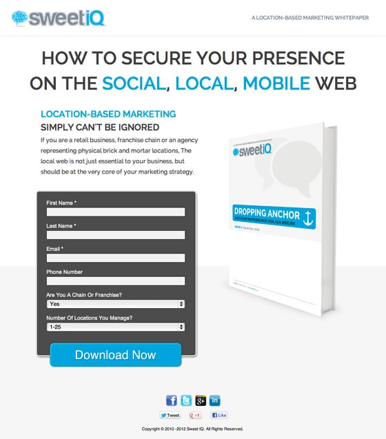
5. SweetIQ whitepaper download
Thoughts
This is a fairly standard whitepaper/ebook download page; however, the underlying design doesn’t support the aesthetic you’d expect from a brick and mortar targeted page. As an electronic document delivered online, it’s important to make it obvious that it’s for local businesses.
There are a couple of ways to do this. Use imagery to show physical businesses, either on the ebook or the background of the page or make the CTA very explicit about the local aspect.
Another thing to mention here is that the copy doesn’t really say anything about what you are downloading! Is it a report? An ebook? This absolutely needs to be addressed.
Hypothesis for A/B testing
By focusing on the local business aspect in the CTA, there will be a better understanding of the local brick and mortar business relevance and more targeted downloads (creating better qualified leads).
A/B testing advice
Suggestions on what to test to prove the hypothesis
- CTA copy: I would test the current CTA copy against something more explicit like “Download your location based whitepaper now”, with a short supporting line beneath the button that says “For brick and mortar retail businesses”.
| Design principle | How’d it do? |
| Encapsulation | Again, I’ll defer to Mr. contrast here. |
| Color and Contrast | The form area stands out really well on this page. You can’t help but notice it. In this instance I’d try going for a red button to make it stand out from the main color palette. Here, the page is so simple that there’s no real visual complexity to compensate for, but you should still get in the habit of practicing separation. |
| Try Before You Buy | Whenever you have an ebook/whitepaper/report to offer, you need to provide a preview. Sometimes, having a short Slideshare presentation on your page to showcase part of your content can bump your conversion rate (but you need to test). |
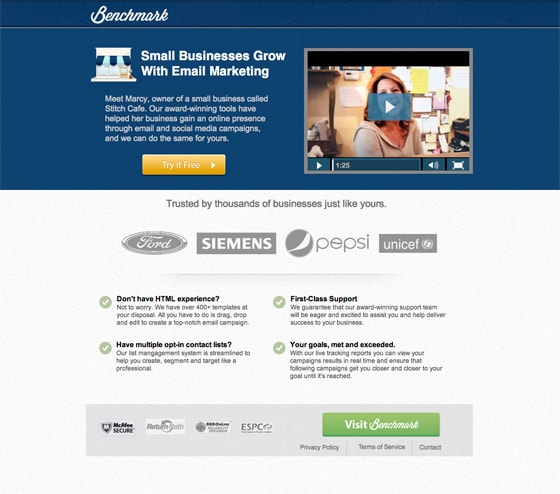
6. Benchmark
Thoughts
There are two different CTAs on the page, both in color and copy. These could use more consistency, and represent what the next step will reveal (I’m assuming the homepage).
No clear value proposition. I don’t know how the company differentiates from the 100 other email service providers out there.
Hypothesis for A/B testing
By including a strong value proposition that illustrates why Benchmark is unique, people will be more willing to click through to the next step.
A/B testing advice
Suggestions on what to test to prove the hypothesis:
- Tagline: There could be a tagline right next to the logo (to use some of the wasted space up there) that helps define the company right away. After all, Benchmark doesn’t say email to me.
- The primary headline: This could be stronger, again, differentiation is key here. Why should I care about Benchmark? What’s the main difference? I’d suggest a two-level headline, where the main header explains the core benefit, and the secondary headline backs it up with supporting information (stats, number of customers etc.) Then I’d move it over the top of the first paragraph and video.
- Image or video of the software in use: Instead of focusing on a testimonial at the first level, I’d include some bullet points that support the headline again — and a video or screenshot of the software. (Then move the testimonial further down).
Test it and see…
| Design principle | How’d it do? |
| Social Proof | The page talks about small business, and then features giant companies as the supporting proof of success. There seems to be a mismatch of company size that could make people perceive their offering is targeted toward the enterprise market. |
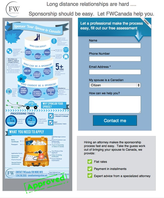
7. Spousal immigration to Canada
Thoughts
Well this is a first! An infographic on a landing page. Very cool. Although time consuming to read.
The opening headline is too situational, rather than descriptive. It would be stronger if it were simplified, rather than cute. The infographic has it right: “Sponsor your spouse to Canada”.
Hypothesis for A/B testing
By changing the page title to directly describe the purpose of the page, the bounce rate will be lowered, and conversions lifted.
Replacing the infographic with key facts in written form will improve the clarity and time spent reading, resulting in more people completing the form, as they will have a better idea of what the benefits of using FWCanada are.
A/B testing advice
Suggestions on what to test to prove the hypothesis:
- Page title: Change the page title to “Sponsor your spouse to come to Canada” and use a subheader that says something like “Let FWCanada make your sponsorship easy”.
- Replace the infographic: Take the key points out of the infographic to inform readers who can apply, who can be a sponsor and how to apply. Probably in the form of an intro paragraph and sectioned sets of bullet points.
| Design principle | How’d it do? |
| Encapsulation | It’s hard to stand out on this page as it’s made up entirely of boxes. I think the best thing that could be done for this page would be to add some white space to let it breathe. |
| White Space | As I mentioned, this would be the saving grace for this design. By shuffling the page elements around, to offer up the required information before the call to action and by creating a better hierarchy of information, the page wouldn’t make you jump around wondering which order you should be consuming it in. |
| Urgency and Scarcity | I think I’d urgently move away from an infographic and back to regular content, even though it’s a novel idea. |
| Social Proof | The goal of the company here is to perform a legal procedure. For this reason it really needs some strong social proof. It’s the perfect service to leverage success stories. I would be reticent to try using this page without to be honest. |
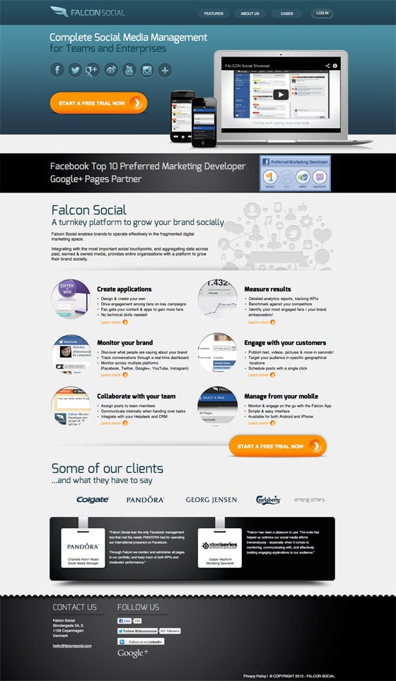
8. Falcon Social
Thoughts
This page is actually a microsite, so I would first suggest ripping out the header and footer navigation to increase the on-page engagement and turn it into a promotion-specific landing page.
What Falcon Social does really well is something that I’ve been preaching for a long time, namely the use of lightboxes to show extended content without leaving the page. This happens if you click any of the ‘Learn more’ links.
However, the page lacks explanation of what the solution provides prior to asking someone to start a free trial. This could include having an introductory paragraph beside the video that mentions how long the trial is along and include a benefit statement.
Hypothesis for A/B testing
By changing the CTA copy to a benefit-driven statement and telling the customers what they will get when they sign up, more people will start a trial.
A/B testing advice
Suggestions on what to test to prove the hypothesis:
- CTA copy: To test different CTAs, I’d run the original against a core benefit CTA such as “Grow Your Brand Socially” and a third CTA that says “Grow Your Brand Socially” with a smaller supporting “x-day free trial” directly beneath the button.
| Design principle | How’d it do? |
| Color and Contrast | The CTAs on this page really stand out. If you try squinting at the page, they are rich with stark contrast. |
| White Space | Having the space surrounding the main content area (on both sides), it gives the page a less cramped feeling. If you try to imagine the content going all the way to the edges — maybe to try and reduce the height of the page — it would be much harder on the eyes. There is a lot of content here, so it could still use a little more space vertically. |
| Social Proof | This is a good way to use testimonials. It starts with a customer list, then moves on to hear what some of them are saying. In general the information hierarchy is nicely done on this page: intro, details, supporting statements. |
9. Manpacks
What I like
- It’s sexy: Predictable response? Yes, absolutely. That’s the whole point.
- Validation: They jump right into showing off the famous publications that have featured their company. From a design perspective, the grey monotone prevents a mishmash of color, preventing any visual distraction from the call to action (CTA).
- Value propositions: The main content on the page answers two simple questions: “What is it?” and “Why should I care?”
- Testimonials: The second is one of the funniest I’ve read. “Socks as a Service” — genius.
- Removal of doubt: The subtext below the CTA lowers the perceived risk, which can improve the click-through-rate (CTR).
What I’d change or test
- Tagline: To make it more immediately clear what the purpose of the page is, I’d add a succinct tagline beside the logo.
- Main title (core value proposition): There are a couple of ways to use a headline: A) use a very clear statement of what you are offering to enable an understanding of the purpose of your page, or B) entice your visitor to want to keep reading by using a seductive headline. They’ve gone with B here, presumably in an attempt to catch your attention and increase curiosity (or to push a particular button). For a test, I’d try approach A and make it really clear from the get go — what Manpacks is (this would work really well with the tagline to help pass a five-second test).
The example below shows an alternate page they created, presumably to speak to a different segment or create a different emotional trigger.
| Design principle | How’d it do? |
| Encapsulation | Here the rule of encapsulation is applied to the content. Adding the blue container separates the main content area nicely, making the reading experience much simpler. |
| Social Proof | This is the best and funniest example of a testimonial I’ve ever seen, and fits the fun brand perfectly. The Tweet on the bottom-right contains the phrase: “Socks as a Service” playing off the SaaS acronym. Brilliant. Always makes me laugh. |
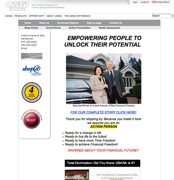
10. That reset button is what I’d click
Notice the big red button on the bottom-left? Reset what? Your business idea? Your design skills? I just hope something magical happens when you click it.
What I like
Nothing… Awkward!
What I’d change or test
Unlock the potential for what? Living in a cul-de-sac in a Florida gated community? Be a little more specific about what the purpose of the page and offering is.
11. Sugar Daddies
What I like
Again, not much to boast about here.
What I’d change or test
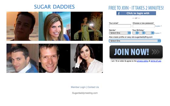
Okay, if rich men are your thing, go for it. Who am I to stop you? But unless I’m mistaken, shouldn’t they at least be men? Three of these look distinctly female to me. BTW, I searched “get rich quick” while searching for examples, and this is what I got — I guess marriage/dating is one method.
I get that the hot women are there to help sell the idea (to the men) of using money to “get what you want”. But still, throw in a few statements of what the “service” provides. You’ll get more conversions if people know what to expect. And maybe add a little class. #JustSayin.
12. Zen Web Solutions
What I like
- Good message match on form: It’s important in form design to ensure that your form header matches the copy on the button. This really focuses the purpose of the page. Remember never to use the word “Submit,” as this breaks the rule and you lose the supporting information. So great job here.
What I’d change or test
- Client results are hard to decipher: The client results image is an important part of the page header, yet it doesn’t really make much sense. I’m not sure what membership services are, so this could use a more descriptive image and supporting statement.
- Form purpose could be simplified: Currently, the form has two purposes. A phone number to contact the company to discuss business, or to download a marketing guide. As the form action is to get the guide, I wouldn’t muddy the waters by having the phone number in there. I’d suggest placing it beneath the form area as a secondary action. Hit them with the free content first and then the request for them to call. You could also test flipping them into the opposite order.
| Design principle | How’d it do? |
| Directional Cues | I like the way the “Find out how we can help you” statement has an arrow after it, pointing the way to the form, and the next step. |
| Color and Contrast | There are quite a lot of orange elements on the page. By choosing a button color that’s not within the orange range you will make it stand out more. Blue or green would be good, and I’d also bump up the size to make it more dominant. The form container could also use a little something to make it stand out from an otherwise flat page. |
| Social Proof | The testimonials also have a success metric net to them, which is a smart strategy. However, it could be communicated more effectively if it was written out, rather than trying to play with an image. Bad use of design. |
13. Certify
What I like
- Expectations are communicated next to the form: Beneath the form header, you are told that someone will contact you within 24 hours
What I’d change or test
- The video poster frame should be more enticing: A poster frame is the image that is visible on your video before the play button is clicked. In many cases this is left to be a screenshot of the start of the video. It can be more effective to have a descriptive and enticing benefit statement as the starting point — to make people want to watch.
- Asking for contact too early: One thing I would test is the placement of the form. It’s good to be above the fold for the most part, but when you are asking someone to engage in communication with you, you might want to expose them to more information about your product offering first. It could be as simple as putting a few bullet points in place of the form and nudging it down a bit. This could mean that you need to move the third feature block somewhere else, and switch it to two or four. Or you could extend the header area to be longer, and balance the design by putting a relevant statement beneath the video, talking about a benefit of the service. Or you could switch the testimonial into this spot.
- Never submit: Change the button copy to say something like “Please contact me for further information”. Polite and to the point.
| Design principle | How’d it do? |
| Encapsulation | As I mentioned above, if you shifted the form down to sit half in and half out of the main header area, you could encapsulate it nicely in a design element that really separates it from the surrounding elements, by virtue of how it would break existing lines. |
| Color and Contrast | The color choice for the two CTAs (just one please, tsk tsk) does contrast with it’s surroundings, but something about the design is just awfully flat. But at a distant glance they do stand out. |
| White Space | There is some generous white space in the main content area which lets your eyes flow down the page through the content. It would be enhanced further by using a larger type size, with an appropriate line height to give the copy room to breathe also. |
| Try Before You Buy | Video product demos are always a good window into what you are offering, and can simplify the subsequent content consumption as you can easily scan to seek out any remaining holes in your buying process. In this example, you could easily skip the 1, 2, 3 content below the video as it’s covered in the video. |
| Social Proof | The subheader of the page is actually a testimonial which clarify the purpose of the product at the same time as adding social proof. |
14. FluidSurveys
What I like
- Clear value proposition: The headline is very simple and leaves no doubt about the purpose of the page and the product. And it’s nicely backed up by a well written explanation of some of the core benefits directly below.
- Highlighted testimonial: The brushed highlight of the testimonial gives it a bit of extra design zing and prevents the page from feeling too text heavy.
- Contrast: They chose two nicely contrasting colors to highlight important elements. The free label, and the form CTA.
- Context of use: Their choice of imagery lets you know that the product can produce mobile-ready polls.
- Validation: Like the example above, they provide a strong sense of trust by including a set of logos.
- They’re Canadian! Woot!
What I’d change or test
- Remove the footer navigation: Any extraneous navigation on a landing page can lead your visitors down the wrong path. I’d recommend removing the footer nav to simplify the available choices.
- Explain the logos: Add a small label (like example #1) to explain that they are client logos (or sites that have featured/written about them).
| Design principle | How’d it do? |
| Color and Contrast | Color is used here to set up the informational hierarchy appropriately: top, middle, bottom. Which allows you to visually break the information into three pieces, speeding the reading process. The CTA also stands out as the only green element on the page. |
| White Space | Very simple layout with a spacious design. Let your eye wander around the page and you’ll see how easy it is to identify each block of information. Remove the footer navigation and it would be even stronger. |
| Social Proof | Just a little touch of design behind the testimonial helps to make it stand out as different from the content section above it, helping to set a visual barrier that keeps your eyes in place when you are reading the three chunks above. |
15. Golden Sands
What I like
- Experience: It immediately makes me want to go on holiday and stay in a luxury hotel. The pillows are literally selling me softly.
- Price: Travel is very much about price, and they get that out of the way right off the bat, so you can move on to the finder details after unerstanding if you can afford it or not. #smrt
What I’d change or test
- The form header: Apply now? For what? It’s unclear what you’re applying for — I thought it was a booking site, but apparently I have to apply for something. Make it clear why people are filling out your form.
- Primary value proposition: There’s no clear statement of what the page is for or what you’ll get. I’d try moving the hotel logos from the top and adding in a strong value prop.
- Exclusive: There is a mention of an exclusive preview invitation, but it doesn’t explain what you’re being invited to. I’d also make this stand out more if it’s an important selling point — perhaps using some visual cues to draw the viewer’s eye.
| Design principle | How’d it do? |
| Encapsulation | The use of opacity for the form container is a good example of drawing just enough attention to the form, while still following the soft design aesthetic of the page. |
| White Space | The use of darker areas on both sides of the content helps to drive you through the content in the middle of the page, like a funnel. |
| Social Proof | Good and bad. The Trip Advisor certificate of excellence let’s you know that a recognized authority has validated the company. The testimonials shown are anonymous, which reduces their impact (as they could have been made up). Always ask permission to use a testimonial and include the name of the person providing it for extra trust points. |

Create Higher-Converting Landing Pages Using Conversion-Centered Design
16. Echodemic
What I like
- Opening statement: The opening sentence describes their offering perfectly and succinctly.
- Honesty: It tells you the cost, so you can weigh up the potential value associated with extending your brand reach.
- Clear contact method: The big phone number increases the trust factors by letting you know there are real people to deal with.
What I’d change or test
- Move the form: Stick the form above the brand logos.
| Design principle | How’d it do? |
| Color and Contrast | On this page, my eyes have no idea what to do. They jump around all over the page, trying to find an area of importance. The contrast needs to be knocked way back and be aligned better in terms of heavy vs. light. Don’t even get me started on the form. Even if you manage to work your way down to it, it’s so bland and nondescript, with no real purpose attributed to it. |
| White Space | Re-architecting the page to focus on one element alone with two columns of visually related content would greatly simplify the reading process. |
| Social Proof | The Facebook follower number lends some credibility to their appeal, as it’s what they are selling as a service. But not enough to really inspire confidence. I would remove this until the number is significant. How are the logos connected? Are they just hotel names to help you understand the point of the page? Or are they existing customers? Make this clear with a title if they are customers. |
17. Demandforce
What I like
- Market share: They already seem to have a 30% market share — invest.
What I’d change or test
- Big form: There are only two required fields, so don’t make a visitor feel like they are taking on a long labor to get information. Scale back to just name and phone number. And don’t start the conversation with “Fill in this form.” That’s the equivalent of walking into a clothing store and being told to buy a bunch of clothes before you even try them on. Seduce, or even coerce, but don’t instruct.
- Call to action: The visitor isn’t really looking to sign up — they’d probably respond more to “Request Tour” or “Get Started”.
- Footer: The links in the footer, other than Privacy, are just distractions. Get rid of as many leaks as possible to keep conversion high.
| Design principle | How’d it do? |
| Encapsulation | I like the inverted color of the form container here. The white stands out nicely from the solid background (to steal a comment away from Miss Contrast). |
| Social Proof | As seen on!: Right at the top is a testimonial that describes a benefit and associates the product with a third-party authority, and then backs it up with a great quote from the company showing how it made them extra money (who doesn’t like that!?) — they even have an Amazon review :) |
18. Boost Your Search — free audit
What I like
- ROBOTS: We like robots.
What I’d change or test
- Stick to your guns: Choose one action and stick with it. In cases like this, the email lead is not nearly as valuable as the customer.
- Make two pages: Differentiate the actions “Free audit” and “Paid Plan” into separate landing pages so you can segment the traffic from channels like PPC.
| Design principle | How’d it do? |
| Encapsulation | Too much. Too much. |
| Directional Cues | There’s a tiny one in the form header, but that’s only useful if your eyes can stop darting around the screen. |
| Color and Contrast | Separation of colors with contrast: This is my biggest problem with the page. Everything is in the same three colors, making it super hard to distinguish what the intended conversion goal (interaction point) of the page is. I would try to knock everything back to be within the same basic color hue, so the pricing grid can stand out. I’d also make the two pricing tiers on the outside, the same muted color, to make the recommended (center) tier the most dominant. |
| White Space | None. |
| Urgency and Scarcity | Only the need to run away. |
| Social Proof | Back it up: Cite the sources (statistics and testimonial) show that you didn’t just make them up to get the sale. |
19. Eureka Report
What I like
- Red, White & Black: The color scheme is classic and trustworthy; this is clearly business oriented.
What I’d change or test
- Wait what: The product, Eureka Report, is overpowered by the incentive. Am I getting the Eureka Report or Time Magazine. Fix the hierarchy so it’s clear what the purpose of the page is. Try switching the positioning of the 10 reasons block and the form block.
- Top x: As popular as Top 10s are, smaller lists are punchier and more memorable. Try 5 or 7 — that will give you a littler more space to play with too.
| Design principle | How’d it do? |
| Urgency and Scarcity | This is design principle #5, and is utilized in the top-right corner with a deadline. It would be even better if it were located beside the form, to increase the urgency of the action you are taking. |
20. Monsoon — the value of association
What I like
- Modern tech: Speaks to a very specific modern technology sector (catches the HTML5 nerds is what I’m saying).
- Why?: Strong section on the importance of the company’s technology.
What I’d change or test
- Mobile Apps: The purpose *appears* to be to build mobile apps, but it’s buried in small text beneath the main imagery — much better to use large text to convey the message and *then* follow it up with “context of use” images where you see apps used on mobile devices.
- Talk to us: Why? What is the benefit of talking to you about your project? Try adding a direct benefit beside the CTA that says “Talk to us about your next project, so that we can a,b,c the hell out of it…!”
| Design principle | How’d it do? |
| Encapsulation | The form is above the fold and contained nicely, although it could use a little more contrast and a visual cue to point out that this is what you want the customer to do. |
| Social Proof | Clients: Put the title above the images so it’s clear why they are there. |
21. Dev Auditions
What I like
- Clear value proposition: It’s clearly about hiring better people — focused on dev. But the headline could be clearer (see below).
- Walkthough: The three-step process paints a simple picture of how the company operates.
- Close with the benefits: I like the start, middle and end of this page. Like a good story it leads you through what you need to know, ending with what you’ll get and a closing CTA. +1.
What I’d change or test
- Clearer headline: “Hire Smarter” is generic — if you’re looking at dev hires then make the dev logo bigger or change the main headline into something with greater clarity such as “Hire Smarter Dev Talent”.
- Types of position: As it’s recruiting, I’d include some scope of the types of talent covered as development can be wide ranging. What are your areas of expertise, and geographical boundaries?
| Design principle | How’d it do? |
| Color and Contrast | Here the color choices create a series of segments as you move down the page, and each piece of content stands out well from it’s containing area without becoming a distraction to the page as a whole. |
| White Space | The page is nicely separated with visual chunks, which always aids the reading process. All in all, this has a nice professional feel about how the content is presented. I would spend time on this page. |
| Social Proof | After a while some logos start to become less powerful. Everyone has them, so you need to get creative about their use. My recommendation is to try and position an actual quote from a company in context with a semantically related piece of content, such as a feature description. |
22. RightSignature
What I like
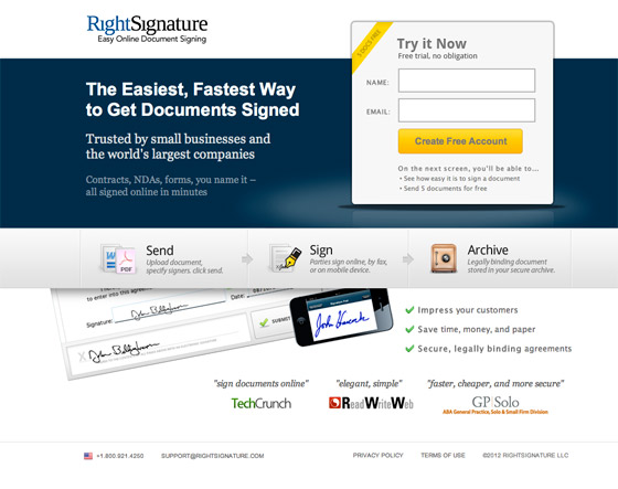
- Clear info about what you’ll get, including freebies for extra incentive: The text beneath the button helps put the visitor at ease by describing what will happen next — and the addition of some free usage is a good incentive to sign up.
- A headline that describes exactly what the product does: I love this headline. It’s so clear and to the point that you couldn’t fail to understand what the service does instantly.
- Demonstration of simplicity: The three-step design below the main area makes it really quick to understand how the service would be used, which will limit the number of bad leads you’ll get as they know what they’re signing up for.
What I’d change or test
- Nothing!: I could go on all day about why I like this page, but I have too many more to write so I’ll stop now. Great job, RightSignature.
| Design principle | How’d it do? |
| Encapsulation | The first thing you see on this page is the form — it’s beautifully positioned and designed for clarity using the rule of encapsulation. And it will always be above the fold. |
| Color and Contrast | The dominant color on the page is also the most important, which makes you consume the content in the right order. |
| Social Proof | High profile testimonials: Big trust factors come from these testimonials as they help describe the benefits through the use of well-chosen quotes, at the same time as showing off the exposure the service has received. |
23. Monetate ebook
What I like
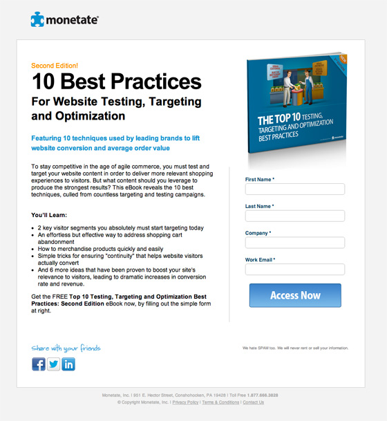
- Design of ebook image shows professionalism: By having a nicely designed cover you show that time and effort went into its creation (as opposed to a boring plain white cover).
- Simple bullets break down why you would want the ebook: The headline for the bullets “You’ll learn” really sets the tone that it’s useful, and listing what you will get out of reading it (as opposed to what’s in it) is a much stronger benefits-driven approach.
- Clear definition in headline of what you’ll get: Sometimes it’s nice with an ebook to know it’s not War and Peace. By limiting this to 10 tips, they stand a good chance of increased conversions by providing an easy to consume resource. While long ebooks can be authoritative, they often go unread.
What I’d change or test
- Social sharing location: People are more inclined to share something right after they actually get it. So I’d suggest placing the social sharing buttons on the form confirmation page. This also has the benefit of removing distractions from the main page.
| Design principle | How’d it do? |
| Try Before You Buy | People react well to the psychology of try-before-you-buy, so adding a preview of the ebook (first chapter or a few choice pages) would help people know what they are exchanging their personal data for. |
24. Go Fun
What I like
- Not much, I’m afraid.
What I’d change or test
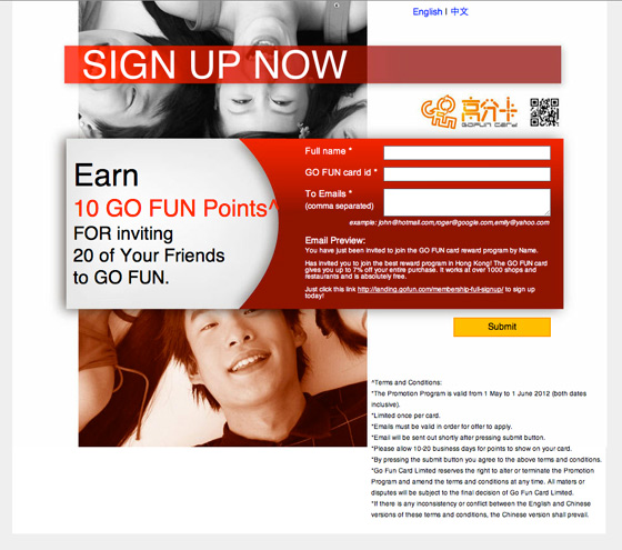
- Change the informational hierarchy: The first thing you see is “SIGN UP NOW,” which is very aggressive, as there’s no real supporting reason to go with it. Message match is critical for conversion, so make this first statement match the ads/link text people are arriving from.
- What is this?: There is no description of what Go Fun is. Most people’s reaction to confusion is to hit the back button. On further exploration, there is a tiny portion of small text that explains what it is. This should be big and prominent. They are asking for 20 emails of your friends, you need some serious trust factors on the page to give out your friends’ emails.
| Design principle | How’d it do? |
| Encapsulation and Contrast | The contrast of the primary area puts some focus on the form, but the form is so overshadowed by the text that it tends to disappear. |
25. Fast Track Sales
What I like
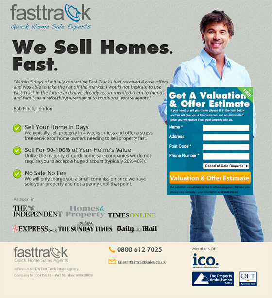
- Strong headline explains value prop in seconds: They sell homes fast, and they explain it fast. Great headline.
- Form headline and CTA explain clearly what you’ll get: Nuff said.
| Design principle | How’d it do? |
| Encapsulation | Clearly the form is the most important area of the page. Both through the contrasting form container and the fact that the dude is holding it. |
| Directional Cues | You might consider the large man a cue of sorts; he uses direct eye contact to draw you into that part of the page. |
| Color and Contrast | The CTA stands out nicely on the page, drawing your attention to the form. |
| Social Proof | A strong set of press logos adds trust to the perception that they have a good public track record. |
26. OCD — clinical trials
What I like
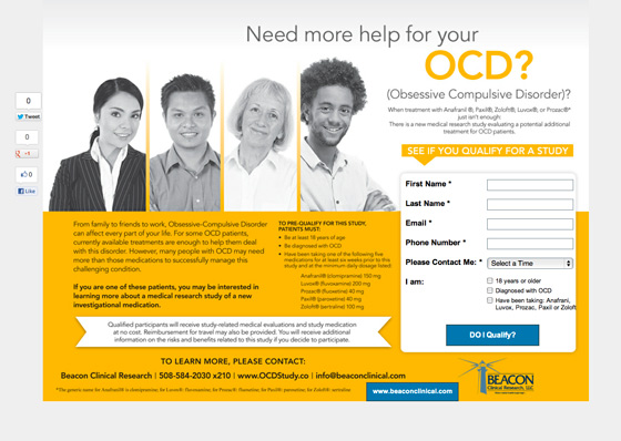
- CTA asks a question: Questions are very powerful persuasion devices, and placing one on the CTA (button) can help people convert as they want to know the answer.
- Photos help relieve the pressure: By showing pictures of regular, everyday happy people, they put you at ease by de-stigmatizing a common issue that can affect anyone.
What I’d change or test
- Move the social buttons: As I keep saying, put these on your confirmation page. If people have just converted they are more likely to share.
| Design principle | How’d it do? |
| Directional Cues | If the color of the bottom section weren’t orange, the arrow above the form area would carry more weight, and would pull you from the word OCD down to the form. |
| Color and Contrast | Here the contrast takes your attention away from the form, and is a little bit over the top visually. Don’t stare too long. |
27. Learn French
What I like
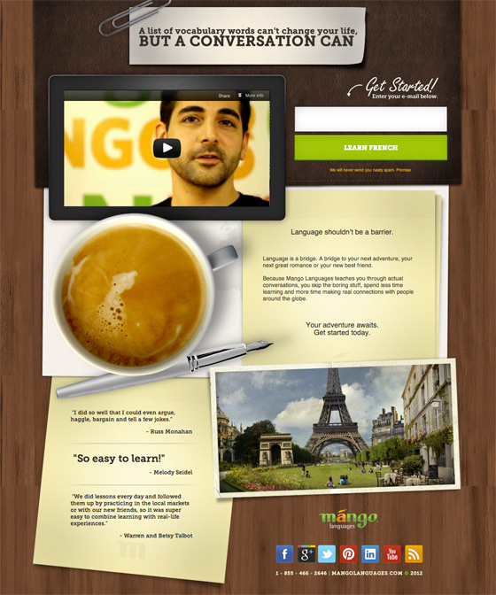
- Use of video: The page is kept simple because the video removes the burden of extra copy, a good technique for enhancing page clarity. It’s also quite an emotional video about the founder’s reason for starting the company after marrying someone from a foreign country. Very authentic.
- Differentiation: The way they leverage the concept of a conversation rather than just learning words, seems likely to be more appealing to potential customers.
- Clear CTA: Learn French. Yup.
What I’d change or test
- CTA copy: I’d try changing the button text to “Learn Conversational French” to maintain the concept of the page.
| Design principle | How’d it do? |
| Directional Cues | There is a small one above the form, but it took me a while to notice it, which is the opposite of the point. |
| White Space | The content areas areas are broken up well by the imagery. I would make the text bigger and more spacious to enhance the readability. |
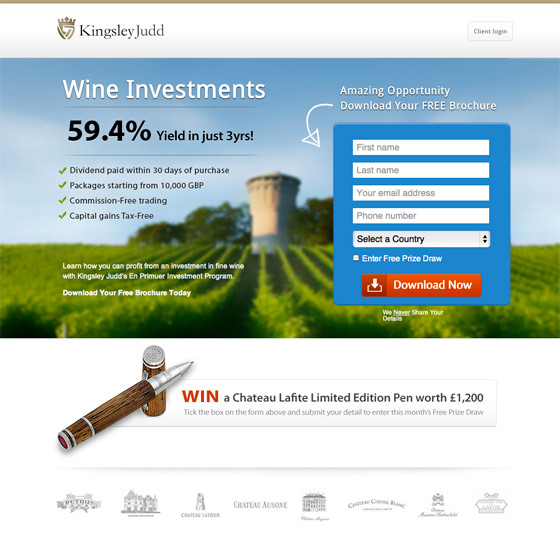
28. Kingsley Judd Wine Investments
What I like
- Wine!: Gotta like that.
- Two-word headline: You don’t get much simpler than that. In just two words they’ve told you exactly what the page is about.
- Beautifully simple and compact design: The blurred image is clear enough to convey the vineyard feeling, while pumping the form box right out at you. Great use of contrast for the form container and button.
- Incentive: Having an opt-in for a free prize draw is a good way to entice conversions.
What I’d change or test
- Terms & Conditions: If you are going to have a prize draw, you should have a link to Terms & Conditions.
| Design principle | How’d it do? |
| Directional Cues | The arrow above the form is subtle but helps to tie in the statement above it with the container. It actually worked in reverse for me, leading my eye up to read the text. |
| Encapsulation | Beautifully done. |
| Color and Contrast | The red button is a smart design choice here. Not only does it stand out, but it connects visually with only one other element. The word WIN. |
| White Space | Lots of it. Especially below the main banner area. Very easy on the eye. |
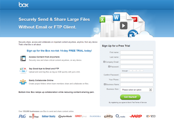
29. Box
Box is a file-sharing service based out of Los Altos, California. Over the last seven years they’ve raised $248 million of venture capital funding.
What I like
- Does what it says on the box (see what I did there?): The headline copy says it all: No jargon involved. Simplicity appeals, especially when it’s solving a very real business problem. This kind of language also helps with SEO, as it mirrors the kind of query someone might use when searching for a file-sharing solution. This is backed up with good clear subheadings, which aid the eye when skimming content.
What I’d change or test
- Weak integration of video: The folks at Box have decided to make the video fade into the background of the header image. I didn’t even see it when I first arrived. This is one of those times where it pays not to try and be clever. I’ve run tests that made it clear that showing the video on the page converts better vs. expecting people to find your link to pop it up.
| Design principle | How’d it do? |
| Encapsulation | Your eyes are immediately drawn to the form area due to the low impact white area to the left. Coupled with the form header, you get what’s going on very quickly (that it’s a free trial). However, adding a benefit statement into the header would explain what signing up for a trial would mean for you. |
| Social Proof | A statement of a large customer base can increase confidence that they’ve been around a while. |
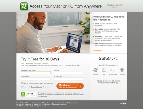
30. GoToMyPC
GoToMyPC is an online service for remote-access to your home and work computers.
What I like
- Clear copy: Features aren’t the strong point here. The main point is that you can access your computer remotely. GoToMyPC focuses on a headline and copy that sells the benefits in simple language. Jargon is a real killer for landing pages, so unless you have a very niche audience, don’t fall into its clutches.
- Layout: The layout of a page should read as we would read a book. This page does that, creating a logical journey: headline, image and description, sign-up, post sign-up actions.
What I’d change or test
- The form position: Switching the form to appear on the right vs. left (and vice versa) is a common test that can show surprising results. Different cultures read in different directions, so give that a try. Switched around, it would also let you read the “Works on” before you deal with the form.
| Design principle | How’d it do? |
| Color and Contrast | The dominant element on the page is the CTA. Great. Not so much. The word “Continue” says nothing about the purpose of the page/form. |
| White Space | Very little white space on this page. As a result I found my eyes jumping around a lot — mainly fighting between the desire to read the content at the beginning and the “Try It Free” statement. There should be a strong headline at the top to prevent this (but that’s not so much white space as it is content design). |
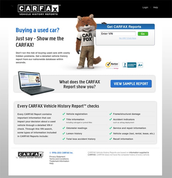
31. CarFax
What I like
- Straight to the point: The main headline asks a question that immediately weeds out anyone that’s arrived here mistakenly. “Buying a used car?” Why yes! I’m in the right place.
- Online vs. offline: The page asks for the car’s VIN — but you’ll most likely only get that by looking for it on the car in person. Luckily they have a mobile page, too, so you can do it on a smartphone. Winning points!
What I’d change or test
- Nothing. I love this page! They clearly had some smart people architect and design the page.
- Button copy: Okay, I’d change one minor thing. The CTA should say “View Report” instead of “Go”.
| Design principle | How’d it do? |
| Encapsulation | Here they encapsulate three pieces of content, which helps you read the content in stepped chunks. |
| Color and Contrast | They use the color blue well to lead you to an interaction. First you read the headline, “Buying a used car?” and then you immediately jump down to the next blue area — the button that says “View Sample Report”. That’s a nice connection and communication flow. |
| Try Before You Buy | They have a sample report for you to look at right off the bat. This is a great way to develop confidence in your visitors, letting them know what’s in store for them. |
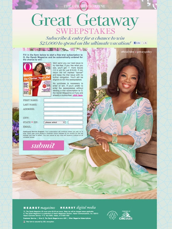
32. Oprah Sweepstakes
What I like
- Media brand match: This is what I talked about at the start. There is a clear correlation between the landing page and the magazine cover. Oprah consistently appears happy, using a strong personal connection (direct eye contact) to make you feel comfortable.
What I’d change or test
- Submit: Apparently Oprah’s designers didn’t read my last landing page examples post. The word “Submit” says nothing about what will happen when clicked. I’d change it to a double line CTA that says:
First line: Subscribe to O Magazine
Second line (smaller text): To be entered in the $25k sweepstakes - Headline and subheader could be better: It’s a double purpose page — subscribe to the magazine and get entered into the sweepstakes. But the headline only says subscribe (not to the magazine) so it could be read as “subscribe to the sweepstakes”. Minor point, but clarity is important. You don’t want have to read all that fine print.
| Design principle | How’d it do? |
| Directional Cues | Oprah creates a strong connection with visitors using the direct eye contact approach. You can use line of sight as a directional cue, or you can trap people on your page by looking directly at them. |
| Color and Contrast | The CTA stands out only because of it’s size. Otherwise it’s visually hidden amidst the overall color scheme. I don’t think it’s a big deal here though as there is no other interaction point on the page to fight with it. |
| White Space | The text on this page is horribly crushed together, making it really hard to figure out the convoluted details of this double-barreled offer. |
| Social Proof | Oprah. That’s enough right? |
33. Intuit
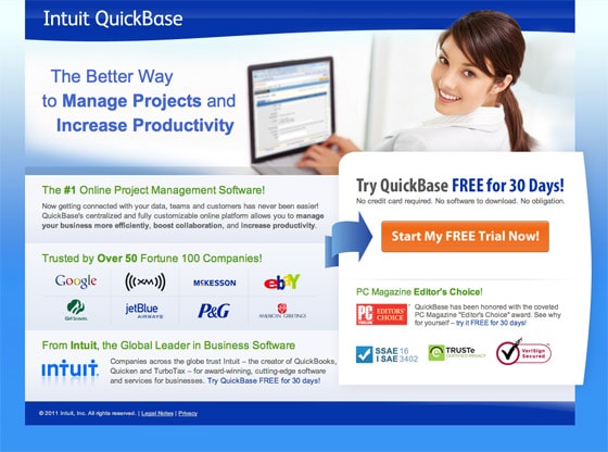
Yet more proof that the big guys are doing it right. This is an excellent landing page. Here’s why:
What I like
- Benefit-based headline: The headline indicates that there are other options out there, but this is a better way to do it. Instead of describing what it does it uses a benefit to enhance the headline.
- Use of directional cue: Using directional cues aids the persuasive nature of a page — here an arrow is used to point you in the right direction.
- Descriptive CTA: It’s obvious that you are going to start a free trial.
- Social proof: The page is littered with social proof indicators: impressive list of customer logos, security symbols and an Editor’s Choice award.
What I’d change or test
- How much is it? There’s no mention of how much it will cost after the 30-day free trial. A good way to include this is to say: “Free for 30-days then pick a plan starting at $xx”.
- No credit card required: This is very important information to know, yet it’s buried as small text. I’d recommend making it subtext in the button to reinforce the lack of a signup barrier.
| Design principle | How’d it do? |
| Directional Cues | The blue arrow certainly makes it clear what you are supposed to do and works nicely with the contrasting color of the CTA. |
| Color and Contrast | The CTA stands out from the rest of the page, but other than that it’s a bit cluttered. |
| White Space | To reduce the clutter, extend the length of the page a bit to let it breathe. It feels like someone asked for the whole thing to be squeezed into as small an area as possible. |
| Social Proof | Here’s an example of client logos that works for me. The reason being that they explain their target consumers (large Fortune 100 companies). At least, I hope that’s the target market! (I have a sneaking suspicion that it’s not as I write this). So maybe I take back my statement :) I do definitely like the “Editor’s Choice” badge — which further reinforces that this might be a lower level consumer product. |
34. Adobe Test & Target
What I like
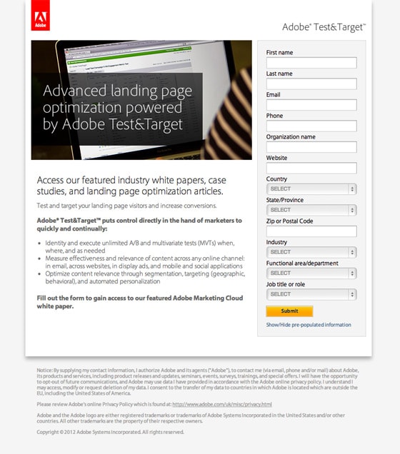
- Accidental genius: When the page loads, the form takes about 2 seconds to appear. Clearly being pulled dynamically from a server somewhere. However, what it does is draw your attention to the form as soon as it loads. Personally I love it as a persuasion device.
- Pixel perfect headline: The use of whitespace around the headline couple with it’s clarity of communication make for a great headline.
- Hierarchy of content: Adobe break the content nicely into nicely flowing chunks:
- Page purpose
- Benefit statement
- Target market based benefit bullet points
- Action statement
Copy this flow of content — it’s really good.
What I’d change or test
- The submit button — jeez: Make it say “Get our Whitepaper”.
- Required? Make it clear which fields are required; this will make the form appear shorter than it is.
The blandness of this page works to it’s advantage to make the CTA stand out. Honestly though, the page is so simple that it would be hard to squeeze much conversion lift out of it, without attacking the number of form fields, which would be my first plan of action.
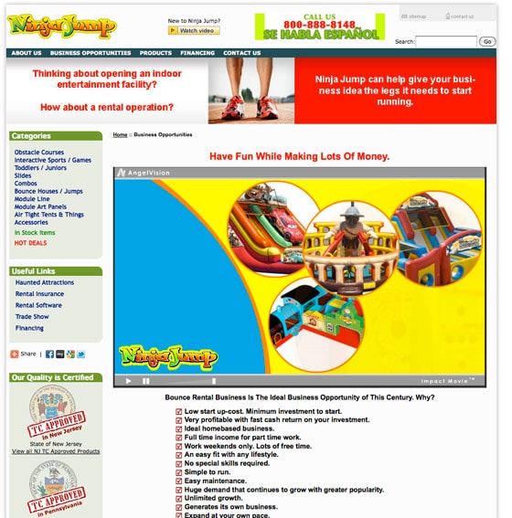
35. Is this for kids making money?
Here’s another shocker.
Looks like you can play with toys while making wads of cash at the same time. Sounds like my kinda gig.
What I like
I hit the back button the moment I saw this site.
What I’d change or test
I came back to look at the landing page for this post. It’s beyond confusing. First off, I’d extract the content from the banner looking thing at the top of the page, as it looks like an advert, which will make people gloss over it. And it has the most important info in it! What the site is actually about.
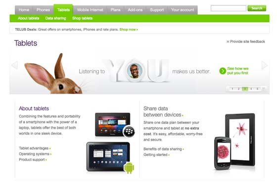
36. Who eats electronics to lose weight?
What’s more scary than a big fake movie guy with a giant knife? Knocking on a door that says come in, we have comfy sofas and free beer, and then falling 300ft out of a building (the door led to the outside on the 20th floor) cos they lied and what you wanted wasn’t behind the door. Where is this going? Good question.
What I liked
This page isn’t bad…
What I’d change or test
While the page isn’t bad, the landing “experience” is bad. Why? I searched for “weight loss.” I know there are tablets for that, but not usually the 9-inch electronic variety. And the bunny ain’t gonna save you this time. TELUS.
Stop bidding on irrelevant keywords!
Well there you have it — 36 landing page designs analyzed, critiqued, enjoyed and ready for copying and perfecting. I hope you were able to take away a lot of juicy ideas for your next design. Tell you what? Why don’t you jump into the comments and let me know? I’ll see you there.
Original Source: 36 Creative Landing Page Design Examples: A Showcase and Conversion Critique






No comments:
Post a Comment