
It’s that time again: Holiday shopping season.
And every business is trying to take advantage of the billions of consumer dollars that will be spent over the next four weeks.
Black Friday and Cyber Monday were only the beginning.
We all know that there were millions of consumers heading online and into stores to grab the first amazing deals of the season. The question is, which brands left money on the table?
Over the past weekend, I took a look at a bunch of Black Friday and Cyber Monday marketing campaigns that were promoted through Twitter, Facebook and Google Adwords.
Some marketers knocked it out of the park.
Others, not so much.
I took a quick tally of how many websites were promoting their sales through the use of landing pages, and I was disappointed to say the least.
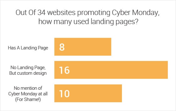
Just 8 out of 34 campaigns used a landing page that focused on the black Friday sale.
16 of the campaigns sent traffic to a corporate website, using some sort of headline or banner to promote the sale.
And a whopping 10 out of 34 companies just sent traffic to their normal homepage without a single mention of Black Friday or Cyber Monday.
That’s huge.
I mean, almost 30% of the companies I looked at figured all they had to do was send out a tweet or an ad to promote themselves on Black Friday weekend!
Thankfully, you know better – you know the power of landing pages.
So what are the tricks you can use on your landing pages to knock holiday shopping season out of the park? Let’s take a look at 7 sites that actually used a landing page to promote themselves this past weekend, and the different strategies they employed to pull it off.
1. Autozone
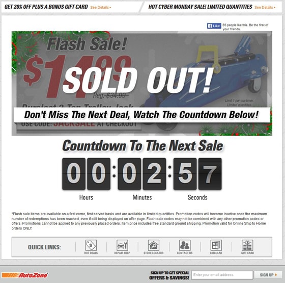
Strategy: The flash sale [promoted via Twitter]
I love the premise of this page. Auto parts retailer Autozone set up a bunch of “flash sales” that were released throughout the day. The counter on the page told visitors when the next flash sale would be available.
In theory, this should increase the engagement of the page and keep visitors’ attention longer by getting them excited about the next sale.
But there are a couple of problems with how they went about it:
Is this page already sold out?
The words “SOLD OUT” are very large on this page. It’s the first thing you see, and I’d be afraid of this driving traffic away from the site. If you went into a store on Black Friday and saw a huge sign that said “SOLD OUT” would you stick around?
I would make the headline more explanatory. Something like this:
“Our latest sale has SOLD OUT, our next sale starts in: 00:02:57”
Don’t make me wait!
Another drawback I see with this page is a high abandon rate. Sure, you’re going to get a few people interested enough to stick around, but a good portion of your visitors are going to bounce off this page and forget about it.
The solution is to add a quick opt-in. Why not say something like:
“Don’t miss our next sale! Enter your email address below and we’ll notify you when our next flash sale begins!”
That way you’re not only building a list for the future, you’re also keeping visitors engaged throughout Cyber Monday.
2. Snack Tools
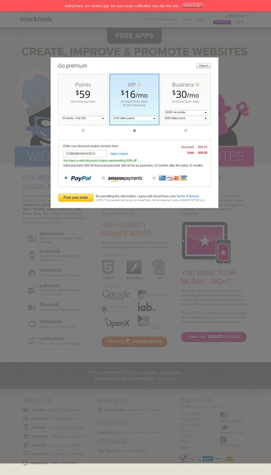
Strategy: The overlay [promoted via Twitter and Facebook]
All right, so this example isn’t a landing page, but it represents an effective way to boost conversions during the holidays.
Web app company Snack Tools put an overlay on its site with the details of a holiday promotion for visitors who arrived via social media.
Their technique presents a few problems:
My attention span is short, give me the quick points
The trouble with competing on Cyber Monday or Black Friday is that everyone is trying to find the best deal. That means they don’t necessarily want to spend a lot of time on your page to decide if your deal is right for them.
This overlay needs less copy and preferably fewer membership benefits. Less is more when it comes to using overlays.
Another option is to remove the close button and turn this into a real landing page! However, if the copy is strong and the offer is clear, this overlay will be able to drive conversions as well as any standalone page.
Just remember, using overlays is a great way to increase sales and conversions. The deal you’re offering is front and center is sure to capture visitors’’ attention.
This call to action is rubbish
“Post your order” is only slightly better than “Submit” – and we all know you should never submit.
No need to get fancy, but a simple “Activate My Account” would be a much better call to action.
3. ONE Medical Group
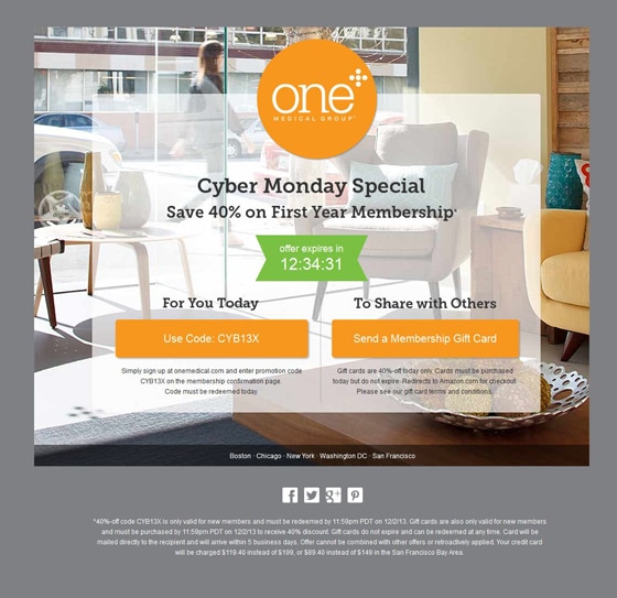
Strategy: Promotional code [promoted via Google Adwords and Twitter]
This is an example of a promotion code landing page. It seems visually appealing at first glance, but there are some serious issues with this page:
Am I shopping for furniture?
The photo in the background looks like a furniture store, not anything medical. Images on a landing page are very important. They reassure visitors that they’ve arrived in the right place.
What exactly does this company do?
This entire page focuses on the Cyber Monday deal, but makes no mention of the product itself. If I were a visitor who didn’t know anything about this service, I would not have enough information to move forward.
Make sure not to lose focus on your product and the benefits it will bring to your visitors. Ultimately, that’s what will sell your product or service.
Where’s the call to action?
Oh right, it’s those two orange buttons. The problem with these buttons is that they’re the exact same colour as the logo (Yikes!).
As a result, they get lost in the shuffle. By making your calls to action look like buttons and giving them enough contrast with the other elements of your landing page, you’ll get a higher click-through rate on your landing pages.
4. Sage
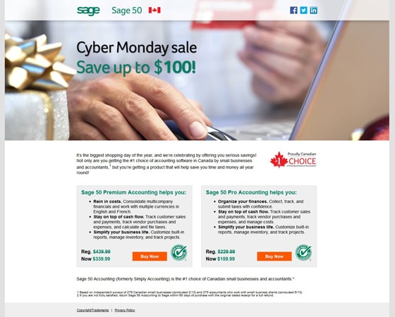
Strategy: Minor modifications to existing landing pages [promoted via Google Adwords]
Why reinvent the wheel? If you already have a successful landing page that’s crushing conversions for your company, you may not need to make large sweeping changes for a holiday promotion.
If you’re in a pinch, you can set up a landing page just like this. Sage sells account software, and it looks like they’re using a basic template for their landing pages. This allows them to swap out the background image and the headlines for various promotions quickly and easily.
But what about urgency?!
This page is simple and to the point, but it could use more urgency. The beauty of Cyber Monday/Black Friday is that you have that urgency built right in. Remind your visitors that this is a limited time offer and it’s going to expire very soon.
Sage could throw a countdown on this landing page, which might give visitors that extra little push to convert.
5. The New York Times
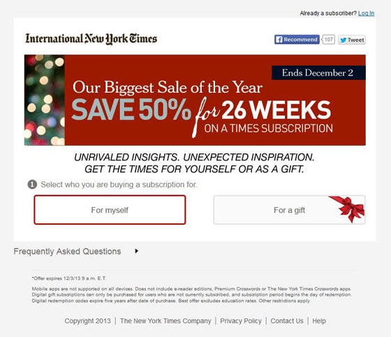
Strategy: Focus on one step at a time [promoted via their website]
I like this page.
It cuts to the core of the offer and doesn’t have any fluff.
My only critiques are that the headline could be more readable and the end date doesn’t have very much emphasis; you want to make sure that every visitor is aware that the deal is limited, which creates a sense of urgency.
Here’s what I like so much about this page:
Frequently asked questions are available, but don’t take up space
The FAQs are on the bottom left of the page. If you don’t need them, they don’t take up much room anyway. But if you’re interested in seeing them, they’re just one click away.
Awesome.
The page stays simple until it needs more information
When you first land on this page the only two options are “For myself” and “For a gift.”
When you make a choice, the page expands and gives you more options.
The reason this is so great is that it keeps the user focused on the task at hand. Giving a visitor too many options all at once can be overwhelming and increase the page’s bounce rate. Well done, New York Times marketers!
No need to get fancy, but a simple “Activate My Account” would be a much better call to action.
6. Vimeo
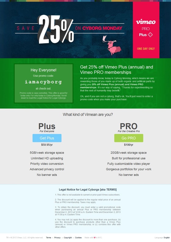
Strategy: Get cheeky [promoted via Twitter]
This is an excellent Cyber Monday landing page. Vimeo has taken Cyber Monday and a unique spin on it with “Cyborg” Monday.
The deal is laid out very clearly and the product and its benefits are outlined in the green section of the page.
But can they improve this page?
My main critique of this page is that the call to actions don’t look like buttons. Also, a fun play on a cyborg countdown could enhance the page and add a sense of scarcity.
7. Young and Reckless
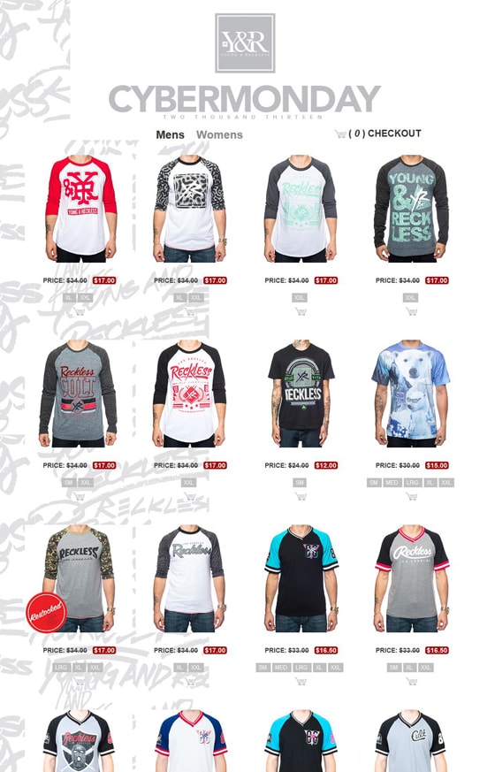
Strategy: The storefront landing page [promoted via Twitter]
If you’re a marketer for an e-commerce site then listen up!
Young and Reckless is the ONLY online retailer I saw the entire weekend that effectively used a landing page concept on their store.
This store/landing page is specially designed to sell their products on Cyber Monday. There is no menu navigation, no distractions and no fluff. Just selling.
The only problem is that they didn’t quite go all the way:
Where is the offer???
The shirts on this page are listed between 25% and 50% off, so where is the headline telling me about it?
A headline like this would be more effective:
“Cyber Monday”
“Until Midnight Only: Save up to 50% on everything you see below”
Just add urgency
This is a long page because there are lots of items listed. Why not include a timer that follows the visitor down the page reminding them how much time they have left on Cyber Monday?
It’s just another element that could drive home the scarcity of the sale.
Now it’s your turn.
Take these strategies and apply them to your own campaigns for better results. The holiday buying season is well worth the extra effort.
What creative campaigns will you come up with before the holiday season is over?
Let me know in the comments below.

Original Source: 7 Black Friday and Cyber Monday Landing Page Examples [with critiques]
No comments:
Post a Comment